


The Color of the Earth: Earth Tones for 2026


Late afternoon in West Texas has a way of settling a room before anyone even walks inside it. The sky goes powdery blue, the soil turns copper and umber, mesquite and sage soften the horizon, and the last light lays a creamy glow across everything it touches. That mix feels familiar because it already lives outside the window.
That's why the color of the earth works so well at home. It isn't one shade. It's a full palette pulled from water, stone, clay, grass, sand, cloud, and weathered wood. For homeowners and renters across Lubbock, Hobbs, Ruidoso Downs, and the surrounding region, that makes earth tones less like a trend and more like a natural language for decorating.
More Than Just a Blue Marble
Pull into a driveway outside Lubbock or Hobbs near sunset and look past the roofline for a second. The sky may read blue, but the land below it carries the colors that usually make a house feel settled inside. Caliche, adobe dust, dry grass, mesquite bark, limestone, and distant hills all bring their own quiet color, and none of them need bright blue to feel true to this region.
That familiar Blue Marble image gave many of us a simple picture of the planet. Useful, yes. Complete, not really. From a designer's point of view, the more helpful lesson is what you notice at ground level. Earth shows up as layers. A broad wash of sky sits over mineral soil, hardy plants, stone, and sun-aged wood. A room works the same way. The backdrop matters, but the surfaces you live with every day usually set the mood.
A good West Texas or southeastern New Mexico palette often starts under your feet, not over your head.
That is one reason earth tones feel so natural indoors here. Step out near the edge of town, where pavement gives way to open land, and one view can hold rust, tan, dusty rose, and soft cinnamon at the same time. After a rain, the same soil deepens. Early light can warm it toward peach. Evening can pull more red from it. Color shifts with light, moisture, texture, and distance, much like paint does from a swatch card to an actual wall.
Designers use that idea every day. Instead of asking for one exact “earth color,” it helps to build a palette the way the region presents itself outdoors. Start with a steady base such as sand, clay, or warm stone. Add a plant note like sage or olive. Then bring in a darker anchor, such as walnut, iron, or weathered leather. If you want that grounded look in a hard-working surface, Tiles Mate's natural stone look tile guide shows how stone-inspired finishes can carry that same natural character indoors.
A home inspired by this part of the world can be calm, warm, and layered. Clay, bone, sage, sun-faded gold, cedar brown, and pale mineral gray all belong here. Those colors do more than match the view outside. They help a room feel rooted, which is often what people are really asking for when they say they want a space to feel comfortable.
Defining the Colors of the Earth
Earth tones get talked about as if they're obvious, but plenty of readers still pause when it's time to pick paint, fabric, or flooring. The simplest definition is this. Earth tones are colors that look like they come from the natural world. They feel settled rather than sharp, and they usually carry a little gray, brown, or warmth that keeps them easy to live with.
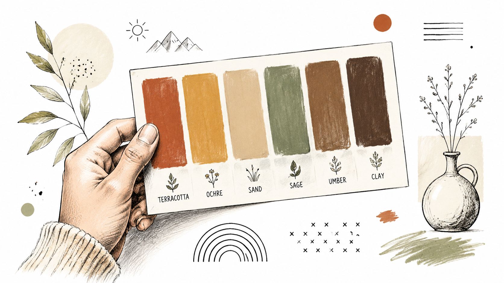
There's also a helpful planetary way to think about them. This explanation of Earth without its atmosphere notes that the planet wouldn't appear blue at all. Its surface would read more like brown land, green forests, and white ice. That's a practical design lesson. Remove the big overhead effect, and the true base palette comes forward.
The four families that matter most
Most earth-tone rooms are built from four color families.
Browns and umbers bring weight. These are the shades of soil, bark, leather, and weathered wood. They help a room feel anchored, especially when floors, casegoods, or larger upholstery pieces need to look steady rather than temporary.
Greens with gray in them calm a space down. Think sagebrush, olive, moss, or muted eucalyptus. These work well when a room needs softness but doesn't want to feel sweet.
Neutrals from sand and stone keep things breathable. Cream, putty, taupe, flax, limestone, and warm greige give the eye a place to rest. They're often the best starting point for walls and larger textiles.
Clay colors and terracottas add heat. These are the colors of canyon walls, fired pottery, brick dust, and sunlit adobe. A little goes a long way, but without some warmth, an earth-tone room can feel flat.
Why these colors feel so comfortable
Earth tones work because they don't fight each other. A harsh white can make a room feel exposed. An icy gray can feel detached in strong sun. Earth-based colors usually carry a visual softness that helps materials relate better.
A practical way to read them is by emotional role:
| Color family | What it tends to do in a room | Best use |
|---|---|---|
| Brown and walnut | Grounds the space | Wood furniture, leather, rugs |
| Sage and olive | Relaxes the eye | Accent chairs, bedding, drapery |
| Sand and stone | Opens things up | Walls, large upholstery, tile |
| Terracotta and clay | Adds welcome and warmth | Accent walls, pillows, art, ceramics |
Practical rule: If a color looks good on a rock, a hillside, or a handmade pot, it usually has enough complexity to live well indoors.
Materials matter just as much as paint. A flat beige wall can feel dull, while the same shade in linen, plaster, boucle, oak, or stone-look tile can feel layered and alive. For readers comparing surfaces, Tiles Mate's natural stone look tile guide is a helpful visual resource for seeing how stone-inspired finishes can add texture without making a room feel busy.
Where readers often get stuck
The most common confusion is mixing up earth tones with dark colors. They aren't the same. Sand, oat, and chalky clay are earth tones too. Another hang-up is assuming every earth-tone room has to look rustic. It doesn't. The palette can support Southwestern, organic modern, traditional, casual, or clean-lined spaces, depending on the furniture shape and finish.
That's a key advantage. Earth tones are flexible, but they still feel rooted.
Your Essential Earth Tone Palettes
Once the main color families make sense, the next challenge is choosing combinations that already know how to work together. A good palette saves time because it narrows the field. It also helps with consistency, so the living room doesn't drift one direction while the dining area heads somewhere else.
The easiest way to use the color of the earth is to choose a mood first, then assign each color a job. One shade leads, one supports, one warms, one cools, and one adds contrast.
Three palettes that translate well at home
The palettes below are designed for practical use. They can guide paint, upholstery, rugs, bedding, drapery, and accessories. The paint suggestions are descriptive examples rather than exact brand matches, which gives readers room to compare similar options in store.
| Palette Theme | Color Name | HEX Code | RGB Value | Example Paint |
|---|---|---|---|---|
| Desert Sunset | Terracotta Clay | #B65E3C | rgb(182, 94, 60) | muted terracotta wall color |
| Desert Sunset | Canyon Sand | #D8C3A5 | rgb(216, 195, 165) | warm sandy beige |
| Desert Sunset | Adobe Rose | #C98B7A | rgb(201, 139, 122) | dusty clay pink |
| Desert Sunset | Dry Mesquite | #6E5A46 | rgb(110, 90, 70) | medium brown accent |
| Desert Sunset | Evening Sky | #7E97A6 | rgb(126, 151, 166) | softened blue-gray |
| High Plains Oasis | Sagebrush | #9AA17B | rgb(154, 161, 123) | muted sage green |
| High Plains Oasis | Limestone | #E6DFD2 | rgb(230, 223, 210) | creamy warm off-white |
| High Plains Oasis | Prairie Taupe | #A58F7A | rgb(165, 143, 122) | soft taupe |
| High Plains Oasis | Deep Juniper | #5F6B5A | rgb(95, 107, 90) | dark green-gray |
| High Plains Oasis | Weathered Bone | #F2EBDD | rgb(242, 235, 221) | pale bone neutral |
| Adobe Warmth | Fired Clay | #A84F35 | rgb(168, 79, 53) | rich adobe red |
| Adobe Warmth | Desert Cream | #EFE2CC | rgb(239, 226, 204) | warm cream |
| Adobe Warmth | Ochre Dust | #C7A15A | rgb(199, 161, 90) | soft golden ochre |
| Adobe Warmth | Saddle Brown | #7A5A3A | rgb(122, 90, 58) | classic brown |
| Adobe Warmth | Smoke Linen | #B9B0A2 | rgb(185, 176, 162) | warm gray-beige |
How to pick the right one
A reader standing in a room can usually choose the best palette by answering three questions.
What does the natural light do?
Bright, hot light can handle richer clay and deeper brown. Dimmer rooms often need more cream, sand, and pale taupe to stay open.What needs to stay?
Existing floors, cabinets, brick, and wood furniture already set part of the palette. Earth tones work best when they cooperate with those fixed elements rather than trying to erase them.How should the room feel at night?
Some rooms need energy. Others need rest. Desert Sunset feels social and glowing. High Plains Oasis feels quieter. Adobe Warmth feels enveloping and gathered.
Choose one lead neutral for about half the room, then let the stronger colors show up in smaller doses through pillows, art, pottery, or a single painted surface.
Wall art can help tie those palette choices together, especially when a room already has the right furniture but still feels unfinished. For readers looking for ideas that coordinate with these tones, find your perfect earth tone wall art offers a useful way to think through subject matter, contrast, and scale.
A simple way to keep palettes balanced
A room usually looks more polished when the colors come from different natural “weights.”
- Lightest note for lift, such as bone, cream, or limestone
- Mid-tone base for continuity, such as taupe, sage, or sand
- Dark anchor for depth, such as walnut, juniper, or umber
- Warm accent for life, such as terracotta, ochre, or adobe rose
That mix keeps the color of the earth from turning muddy. Contrast matters. So does restraint.
Inspiration from West Texas and New Mexico
The strongest earth-tone homes in this region often don't start with a paint deck. They start with a drive, a memory, or a place that keeps showing up in the mind. West Texas and New Mexico hand over color inspiration every day, but it helps to observe the natural setting like a designer rather than just passing through it.
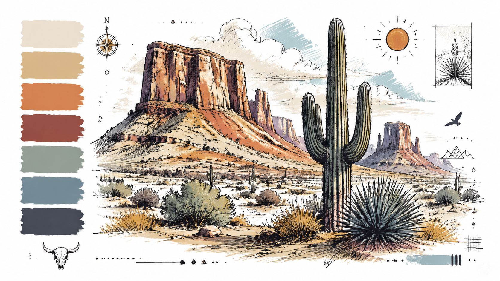
Caprock country offers one of the clearest examples. The canyon walls don't read as one red. They shift between rust, cinnamon, baked clay, and shadowed brown. In a home, that might become a terracotta accent wall, caramel leather seating, and a rug with faded brick and cream woven through it.
Reading local landscapes like a palette card
The plains tell a different story. Sagebrush, dry grass, and distant tree lines create a quieter combination. Those colors are less dramatic, but they're often easier to live with long term. Dusty green drapery, oat-colored upholstery, and natural wood furniture can capture that steady look without making the room feel themed.
White Sands brings another lesson. Bright expanses don't have to be cold. The gypsum reads creamy, not sterile. It's the difference between stark white paint and a warmer white with softness in it. In a living room or bedroom, that kind of neutral helps sunlight bounce gently instead of glaring.
Here's a useful way to translate outdoor scenes indoors:
- Caprock tones work well for focal points. Accent walls, patterned pillows, pottery, or a warm area rug can carry those stronger reds and browns.
- Plains greens are better for soft goods. Upholstery, bedding, and drapery in muted green add calm without dominating the room.
- White Sands neutrals belong on the larger surfaces. Walls, sofas, and bedding in creamy tones make the whole space feel brighter and more spacious.
The landscape already solved the palette problem. The home only needs to borrow from it with some discipline.
One local idea that works especially well in bedrooms
Bedrooms often benefit from the softer side of the region. A palette inspired by pale sand, faded sage, and weathered wood tends to feel restful because none of those tones demand attention. They settle in. Readers wanting more ideas for that look can see how those elements come together in this Southwestern bedroom design guide.
The key is avoiding literal decoration. A room doesn't need wagon wheels, cactus motifs, or heavy-handed Western styling to feel local. It only needs honest color, tactile materials, and a few forms that echo the natural surroundings. Rounded pottery recalls canyon shapes. Woven textiles suggest dry grass and open fields. Natural wood finishes bring in the same visual warmth found in sunlit ground.
That approach gives a room identity without turning it into a postcard.
Bringing Earth Tones Home Room by Room
Late afternoon in West Texas has a way of teaching color better than any paint deck. The light turns a leather chair richer, pale walls creamier, and wood furniture warmer, all within a few minutes. That same idea works indoors. A good earth-tone room responds to light the way the plains, canyon walls, and dry creek beds do outside.
The goal is not to copy the outdoors. The goal is to use the same kind of balance nature uses here. One quiet base. A few stronger notes. Plenty of texture so the room feels lived in instead of flat.
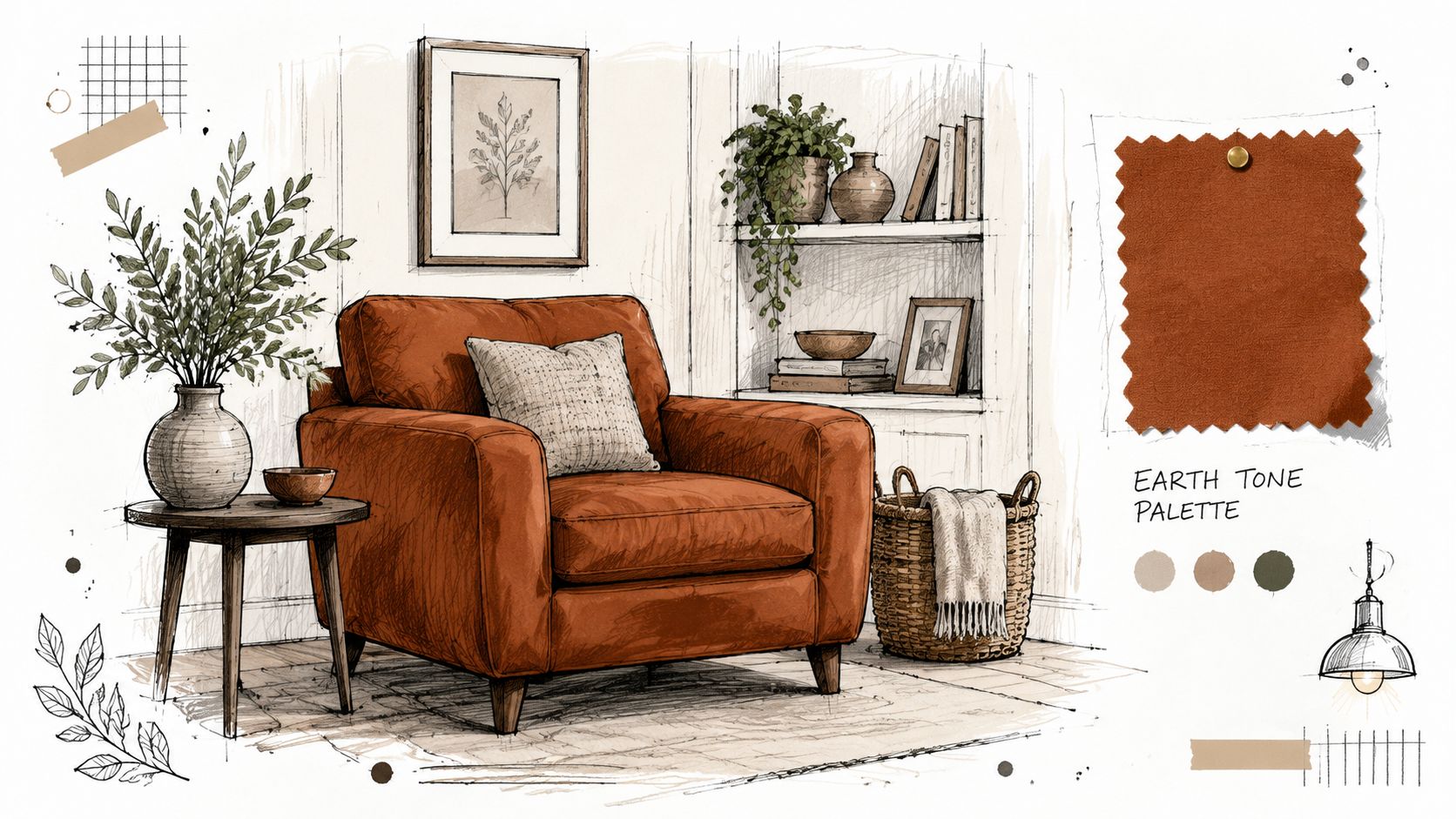
Living rooms need one anchor piece
A living room usually feels off for one simple reason. Too many pieces are trying to lead.
Start with the largest item your eye lands on first, usually the sofa or sectional. In earth-tone rooms, that piece works like the ground under a house. It settles everything else. Sand, flax, camel, and warm taupe are dependable choices because they hold up through changing seasons, different pillows, and shifting tastes.
After that, layer in contrast through material more than color. A walnut coffee table, a cognac leather chair, a woven rug, or clay-toned pottery adds shape and warmth without making the room busy. If the palette starts feeling too orange, a little sage or olive will cool it off, much like a patch of mesquite softens all that red dirt outside.
Readers who want a fuller plan for gathering spaces can see how these combinations come together in this living room color palette guide.
Bedrooms need colors that settle down
Bedrooms ask for a gentler hand. In this room, the softer side of the region usually works best. Pale sand, weathered wood, dusty olive, putty, and warm ivory create the kind of calm you feel just before sunset on the edge of town, when everything turns quieter.
Strong contrast can look sharp in photos, but it often feels too alert in a room meant for rest. A better approach is layering close neighbors on the color wheel. Putty walls, oat-colored bedding, a medium wood bed, and one deeper brown accent create depth without visual noise.
Texture does a lot of the heavy lifting here. Linen, cotton, brushed upholstery, and natural wood keep the room from feeling washed out.
If a bedroom color grabs your attention right away, it will probably keep doing it when you are trying to relax.
Dining rooms can carry more heat
Dining rooms are where richer earth tones tend to shine. This is the room that can handle clay, ochre, tobacco, and deeper stained wood because evening light makes those colors feel generous instead of heavy. In homes across West Texas and SE New Mexico, that warmth often feels especially right. It echoes adobe, canyon stone, and sunbaked soil without turning the room into a theme.
The balance matters. If the walls, table, chairs, and rug all sit in the same dark range, the room can feel crowded. Keep one or two larger surfaces lighter. Upholstered seat cushions, a pale rug, creamy walls, or lighter drapery will give the eye a place to rest.
A simple guide helps:
| Room | Best earth-tone strategy | Helpful furniture direction |
|---|---|---|
| Living room | Start with a steady neutral base | Sofa or sectional in sand, taupe, or flax |
| Bedroom | Use muted layers with soft texture | Wood bed, upholstered bench, quiet textiles |
| Dining room | Bring in warmth through finish and tone | Wood dining table, textured chairs, warm rug |
Furniture usually decides whether the palette works
Paint gets a lot of attention because it is easier to change. Furniture usually carries more of the result. If the sofa is too gray, the room can feel drained. If the dining table is too red, every other warm finish starts to fight it. If the bed frame is too heavy, even a soft wall color will not lighten the room enough.
That is why it helps to choose the big pieces first and let the smaller accents follow. Good earth-tone rooms are built from the middle out. Start with the sofa, bed, dining table, or accent chair. Then add pillows, art, pottery, and throws like seasoning, not the whole meal.
Earth tones also hold up well over time because they work with where design is heading. Homeowners who want the broader picture can explore 2026 interior design trends and see why natural color, tactile material, and grounded comfort continue to matter.
The room does not need more pieces. It needs a few honest ones in colors that already make sense under West Texas light.
Your Design Journey with Earth Tones
The color of the earth gives a home something many palettes struggle to deliver. It offers variety without chaos, warmth without fuss, and personality without trying too hard. It can echo a canyon, a high plain, a gypsum dune, or a stand of sage, yet still feel clean and current indoors.
That's one reason these colors keep showing up in conversations about what's next. For readers curious about the broader direction of interiors, explore 2026 interior design trends for a wider look at where natural materials, grounded color, and lived-in comfort are heading. Earth tones fit that movement well because they're flexible enough to support changing tastes while still feeling timeless.
What helps most when choices start to blur
Plenty of people know they like earth tones but still get stuck when the actual decisions begin. The answer usually isn't adding more options. It's narrowing them.
A practical path looks like this:
- Start with the immediate surroundings. Local color tends to feel authentic because it already belongs to the light outside.
- Choose one major neutral first. Walls, a sofa, or a rug should establish the base before accent colors enter the room.
- Let materials do part of the work. Wood, linen, leather, stone-look surfaces, and pottery add dimension that flat color can't.
- Keep the strongest hues edited. Clay, ochre, and rust usually read best in focused moments rather than everywhere at once.
Readers drawn to cleaner lines with natural warmth may also appreciate the balance shown in this organic modern design guide, where earthy color works alongside simpler shapes and a lighter hand.
Good earth-tone design doesn't copy nature literally. It borrows nature's balance, restraint, and texture.
That's what makes these rooms feel so livable. They don't demand perfection. They invite steady choices, useful pieces, and a palette that still feels right in changing light, across seasons, and through everyday family life.
Miller Waldrop Furniture & Decor helps homeowners and renters turn those ideas into rooms that work beautifully day to day. With curated showrooms in Lubbock, Hobbs, and Ruidoso Downs, personalized design help, and quality furnishings for living rooms, bedrooms, dining spaces, and more, the team gives readers the tools to choose pieces that fit their homes and their routines. For anyone ready to build an earth-tone space with confidence, a practical next step is to explore the showroom selection, compare finishes and fabrics in person, and connect with the design team for guidance that makes the whole process easier.