

Burnt Orange Couch: How to Choose, Style, and Care for Yours


A homeowner can spend weeks choosing wall color, rugs, and artwork, then freeze in a showroom aisle at the sight of a burnt orange couch. The color feels warm, confident, and unmistakably intentional. It can also raise fair concerns: Will it make the room look dated? Will it disappear into dark wood? Can the fabric survive children, pets, sunlight, and daily lounging?
Those are the right questions. A burnt orange couch isn't a casual neutral purchase, but it doesn't need to dominate the room. The right tone, upholstery, scale, and light plan can make it the most welcoming piece in the house. The wrong combination can leave a room feeling brown, dim, or visually crowded. The recommendations below focus on the decisions that determine whether the couch earns its place for years.
Why a Burnt Orange Couch Is Worth a Second Look
A burnt orange couch can look inviting in a showroom and intimidating at home. In a dim living room, it may feel heavy. In a sun-drenched West Texas or New Mexico space, the bigger concern is whether the upholstery will fade. The right purchase depends on light, fabric, room finishes, and how the couch will be used every day.
Burnt orange has a documented design history, so choosing it is a long-term design commitment rather than a short-lived color experiment. The term has been used as a color name since 1915, and the University of Texas later trademarked its specific burnt-orange hue in 1966. The shade also became closely associated with 1970s interiors, when orange upholstery and warm earthy furnishings were widely used. The history of burnt orange explains why the color still carries retro familiarity while fitting contemporary rooms.
That history does not make every burnt orange couch a good choice. A deep rust tone can darken a room with limited daylight, while a lighter terracotta may keep the same warmth without making the walls and flooring feel crowded. Sample the actual upholstery beside your floor, wall color, wood finishes, and window light before ordering.
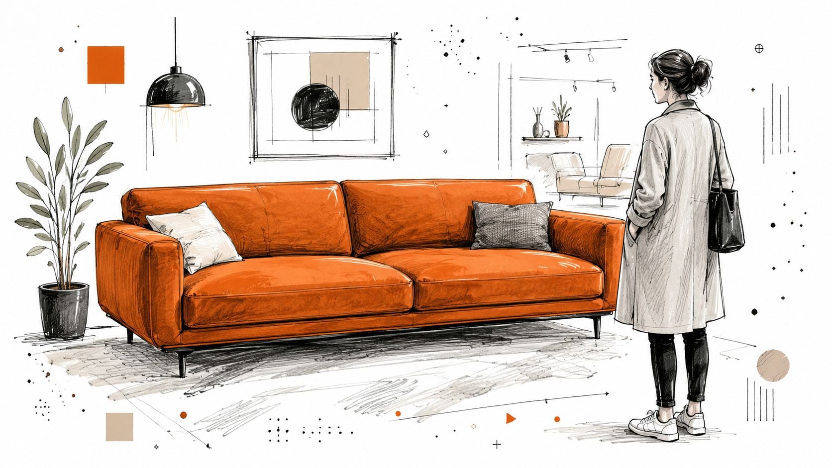
Warm seating continues to attract homeowners who want more character than neutral upholstery provides. Coverage of current sofa colors places burnt orange, rust, cognac, and caramel among the warmer alternatives to gray, beige, and cream. Current sofa color coverage also points to the shade's connection with 1970s interiors and its memorable presence in popular furniture references.
The practical test is simple: can the couch support the room rather than compete with it? Choose a muted or earthy version if the space already contains dark wood, patterned rugs, or strong artwork. In a bright, open room, a richer tone can supply depth and become the main visual anchor.
Where Burnt Orange Sits Among Warm Sofa Colors
| Color | Undertone | Visual Effect | Best Room Style |
|---|---|---|---|
| Burnt orange | Earthy red and yellow | Expressive, grounded, welcoming | Retro modern, eclectic, warm contemporary |
| Rust | Deeper red and brown | Moody, aged, intimate | Traditional, industrial, collected |
| Terracotta | Clay and muted orange | Soft, sunbaked, relaxed | Southwestern, Mediterranean, organic modern |
| Cognac | Golden brown with orange warmth | Refined, rich, adaptable | Leather-focused, classic, modern rustic |
For a lower-risk decision, start with burnt orange, rust, or terracotta instead of bright orange. Then judge the fabric's durability and sun resistance as carefully as the color. A couch that looks right on day one must also hold up to lounging, pets, children, and strong afternoon light.
Defining Burnt Orange and the Tones You Will See
A burnt orange couch can look warm and grounded in one room, then heavy or muddy in another. The difference usually comes from undertone, fabric texture, and natural light. Burnt orange is orange softened with earthy red, brown, or muted yellow, not a single fixed swatch. Showrooms may use the name for shades ranging from deep cinnamon to light clay, so judge the actual fabric rather than trusting the label.
The term also changes meaning across retail and regional design conversations. In some stores, it signals a redder, vintage-leaning upholstery color. In others, it describes a softer clay or ochre shade. That broad usage explains why two couches labeled burnt orange can create very different rooms.
Learn the showroom vocabulary
Separate the options by undertone and depth.
- True burnt orange keeps a clear orange base while reducing its brightness with earthy warmth. Choose it when the room needs a confident focal point.
- Rust moves toward red and brown. It feels quieter and works well with traditional wood furniture, aged finishes, and darker palettes.
- Terracotta recalls fired clay. It reads softer and more architectural beside plaster-like walls, natural fibers, and pale woods.
- Cognac moves toward golden brown. It provides warmth with a restrained, leather-oriented character.
Store lighting can mislead you. Warm bulbs may make upholstery look redder and richer, while cool daylight can reveal gray or brown undertones hidden indoors. Request a large swatch and place it beside the wall color, flooring, rug, and wood finish. Check it in morning, afternoon, and evening light, especially if the couch will sit near an uncovered window.
Practical rule: A small fabric sample confirms undertone, but a large sample shows how the color will behave across an entire sofa.
Match the tone to the existing room
A cinnamon-leaning burnt orange suits cream, warm white, oak, brass, and olive. A brown-heavy shade belongs more naturally with espresso wood, aged leather, and deep green. A clay-leaning tone feels lighter beside woven textures and pale natural finishes.
Use the room's light to set the direction. In a dim room, choose a lighter clay or clearer orange so the couch does not absorb too much visual weight. In a sun-filled room, a muted, brown-based tone can provide depth without making the space feel harsh. That distinction matters in bright West Texas or New Mexico interiors, where strong sunlight can change the color's appearance and accelerate fading.
The right question is whether the room needs clarity, depth, softness, or contrast. Cool gray and blue-white furnishings may need a warmer wall or rug before the couch feels connected. Warm wood and tan textiles can support an orange-forward shade, while a muted version prevents an already warm palette from becoming muddy. Decide the tone first, then evaluate fabric performance and sun exposure before ordering.
Choosing a Fabric That Holds the Color and the Wear
Fabric decides whether a burnt orange couch develops an attractive patina or quickly looks tired. Saturated upholstery makes pilling, flattened nap, uneven sheen, and fading easier to see than on a pale neutral. Start with performance specifications, then judge the color and texture.
The most useful durability measure is the Martindale abrasion test. It records repeated rub cycles before a fabric shows yarn breakage, pilling, or visible wear. Residential sofas are commonly specified around 15,000 to 30,000 cycles for general domestic use, while heavy-duty use starts at 30,000 or more cycles. Treat those figures as a screening tool, not a guarantee. Construction, cleaning, and daily use still affect the result.
Compare the main upholstery choices
Performance polyester blends are the strongest starting point for a busy family room. Tightly woven versions handle everyday friction, clean more predictably, and preserve a saturated shade with less surface disruption than delicate decorative cloth. Read this guide to polyester for sofas for more context on why polyester appears so often in practical upholstery.
Woven jacquards add pattern and texture without depending on a plush surface. Their construction can disguise minor marks, but verify both the abrasion rating and cleaning code. Weave quality varies widely.
Velvet gives burnt orange unusual visual depth. Its pile reflects light, so the couch can appear lighter from one direction and darker from another. It needs regular, careful brushing, and repeated contact can flatten the nap. Choose it for a room where that maintenance fits your routine.
Linen has a relaxed, natural appearance, but it wrinkles and shows use sooner. It suits a low-formality room where gentle wear contributes to the look. It is a poor match for a household that expects upholstery to remain immaculate.
Top-grain leather develops a distinct patina and wipes clean more readily than many textiles. A burnt-orange or cognac finish depends heavily on the leather treatment, so inspect samples in natural light. Use conditioner suited to that finish, and do not treat leather like fabric.
Mohair offers a luxurious, lustrous surface and a long association with iconic orange seating. It belongs in a deliberate, higher-care room. Ask about cleaning requirements, abrasion performance, and light exposure before ordering.
Separate wear resistance from fading resistance
Abrasion resistance does not measure lightfastness. A strong fabric can still fade when sunlight reaches it repeatedly. One industry reference uses an eight-point lightfastness scale, with lower grades fading faster and higher grades offering substantially stronger resistance over extended exposure. Check this specification before placing the couch beside an uncovered window, especially in a sun-drenched West Texas or New Mexico living room.
For heavy traffic, shortlist a tightly woven performance fabric or a well-rated jacquard with suitable lightfastness. For a formal room, velvet, linen, leather, or mohair can work, provided the household accepts the required care. Ask for the fabric code, abrasion rating, lightfastness grade, and cleaning instructions in writing before committing to a long-term color choice.
Making Burnt Orange Work in Your Specific Room
A burnt orange couch can suit a bright, inviting room or make a dim one feel heavy. Insufficient light, dense surrounding finishes, and poor scale create the problem. The same upholstery looks airy against cream walls, yet oppressive beside espresso furniture in a window-poor room.
Start with natural light, then assess the room's proportions. Generous windows can support a deeper, more saturated orange. A dim room needs a lighter, clay-leaning tone, lighter walls, reflective surfaces, or stronger layered lighting. Low ceilings also benefit from restraint. When the couch, walls, rug, and case goods all use deep tones, their visual weight builds quickly.
Use the room's orientation as a design test
Morning light can make orange appear fresh and golden. Afternoon light intensifies its warmth, while shade may reveal brown undertones. Place a large fabric swatch in the actual room and inspect it during the hours your household uses the space. Do not approve the color from a showroom sample alone.
Warm white and cream walls are the most dependable pairing for an airy, retro-influenced room. They define the couch without the harshness that can appear beside a stark blue-white. Natural oak, ash, woven fibers, and pale stone keep the composition light.
Deep green or navy creates a more intimate, library-like atmosphere. Use that combination in a room with strong daylight, tall ceilings, or deliberate ambient lighting. In a compact, shaded space, the dark wall and saturated couch compete for attention and can make the room feel compressed.
Treat dark wood with care
Espresso and dark wood can look polished with burnt orange when the room has enough light separation. If the couch sits against a dark wood wall or beside oversized brown case goods, the upholstery may sink into shadow and the room can feel dense.
Restore balance with a mirror, lighter rug, warm metallic lamp, cream drapery, or artwork that creates pale space around the sofa. Window treatments should control glare without blocking the daylight that gives the fabric dimension.
Before ordering, complete three checks:
- Bring home paint chips and compare them beside the fabric in daylight.
- Choose the rug direction early, because its value and pattern affect how heavy the couch feels.
- Measure the visual contrast, not only the physical dimensions. A dark floor and dark wall need a lighter bridge somewhere in the composition.
Current design coverage continues to highlight burnt orange as a major sofa color for 2025 and 2026. Treat that as context, not a reason to buy. Room-specific sofa color guidance matters less than confirming that the shade has enough light and contrast in your actual room.
Styling Around Your Couch With Confidence
A burnt orange couch should set the room's direction without forcing every accessory to compete for attention. Its color already carries presence, so choose a rug, pillows, artwork, and lighting that create a clear rhythm around it.
Start with the rug. Persian-inspired motifs, muted geometric designs, small-scale tribal patterns, and restrained botanical prints can connect the orange with cream, olive, tan, navy, or rust without copying the upholstery. A flat-weave or low-pile rug keeps the seating area crisp. Plush texture makes it feel more enveloping, which suits a room designed for long conversations.
Warm sofa colors such as reds, oranges, and yellows bring warmth, energy, and personality to a living room, making the space feel inviting for conversation after dinner. Use that quality deliberately. Let the couch establish the room's social mood, then keep surrounding colors controlled.
A modern styling path
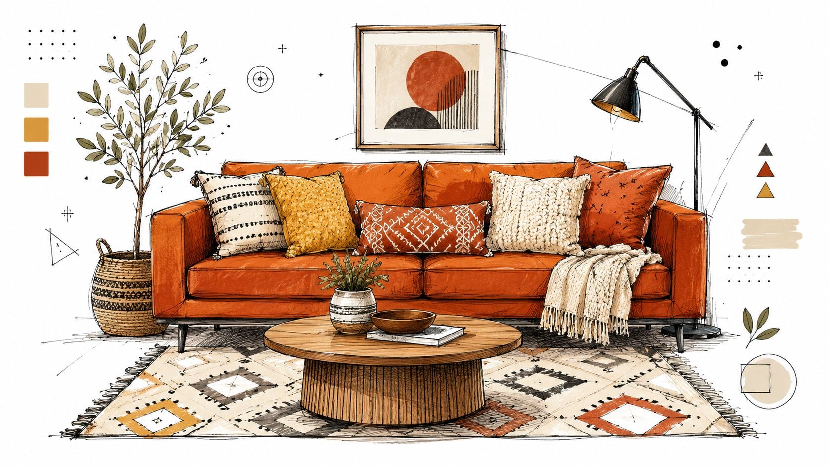
For a modern room, combine the sofa with a light oak or stone coffee table, a cream-and-olive rug, and pillows in warm white, sage, and textured natural tan. Add one graphic pillow in navy or charcoal. Keep the remaining cushions quieter so the arrangement looks edited rather than busy.
Choose artwork that gives the wall breathing room. Abstract forms and architectural drawings can echo the sofa's warmth without repeating its shape or exact color. A slim floor lamp in black, bronze, or aged brass adds height and structure. Warm bulbs help the upholstery retain depth after sunset.
A traditional styling path
A traditional room can make the same couch feel richer and more layered. Pair it with a rug in muted blue, green, and cream, then add small-scale florals, woven checks, or velvet pillows. Darker wood tables fit this direction when the wall, rug, or artwork provides enough contrast.
A framed mirror above or beside the sofa prevents a deep palette from feeling closed in. Brass or bronze lamps, a ceramic tray, stacked books, and a low branch arrangement give the coffee table a collected appearance without crowding its surface.
Change the supporting textiles with the season. In colder months, deeper green, burgundy, and heavier woven throws add depth. In warmer months, linen, cotton, cream, sand, sage, rattan, and lighter wood reduce visual weight. The couch remains the fixed commitment, while these smaller pieces let the room change without requiring a new sofa.
Keeping the Color Bright for Years, Not Months
A burnt orange couch can look rich for years, or develop a faded, uneven face surprisingly quickly. The difference comes from managing two separate risks: friction from daily use and sunlight from nearby windows. Sitting can cause pilling, crushed texture, and uneven sheen. Light can fade the side facing the window, even when the fabric performs well against wear.
West Texas and Southeastern New Mexico homes need a deliberate sunlight plan. Use UV-resistant upholstery where available, add lined window treatments, and position the couch away from prolonged direct exposure. Lightfastness must be assessed separately from abrasion resistance. A fabric rated high for wear may still fade under extended sun.
Match care to the material
- Performance weaves: Vacuum regularly with an upholstery attachment, especially along seams and between cushions. Blot spills quickly, then follow the manufacturer's cleaning code rather than reaching for a general household spray.
- Velvet: Brush with the pile using a soft upholstery brush. Avoid hard rubbing, which can flatten the texture and change how the orange tone reflects light.
- Linen: Blot spills instead of scrubbing. Natural wrinkling is part of the material's character, and professional cleaning should follow the stated care code.
- Leather: Dust with a soft cloth, clean with a product suited to the finish, and condition it according to the upholstery maker's instructions. Keep leather away from direct heat.
- Mohair: Vacuum gently and use professional care when needed. Improvised stain treatments can disturb the pile or alter the dye.
Review the basics of checking colour fastness before ordering. The fabric should resist color transfer and visible change under the conditions it will face in your home.
Build a sunlight routine
Rotate loose cushions periodically so one side does not receive all the exposure. Close sheer or lined treatments during the strongest direct sun, and leave space between the couch and an uncovered window. Test a large swatch in the actual room, particularly if the sofa will face a bright southern or western window. Check it in morning and afternoon light before committing to the full order.
Keep the color plan practical. A window treatment that stays open all day can undermine even a well-chosen fabric.
For a stain emergency, follow the upholstery code and use the appropriate method in this upholstery stain-removal guide. Schedule professional cleaning according to household traffic, visible soil, fabric instructions, and the couch's condition, rather than following a rigid universal calendar.
Sizing, Layout, and Local Buying Guidance
A burnt orange couch should fit the room before it sets the mood. Measure from the entry door to the intended wall, including corners, stair turns, elevator interiors, and narrow approaches. A striking color cannot compensate for a piece that blocks a doorway or leaves no usable path.
Choose the configuration according to how the room functions. A standard sofa defines a seating area without wrapping around the entire conversation space. A sectional provides more lounging room and can divide an open-plan living area, but confirm the chaise direction and wall clearance before ordering. A loveseat suits compact rooms. A sleeper adds guest capacity, provided the bed mechanism has enough clearance to open fully.
Measure the complete route
Record the narrowest doorway, the ceiling height along the delivery path, and the distance between walls or railings. The listed footprint is only part of the calculation. Reclining components, removable backs, chaise depth, and delivery angles can determine whether the couch reaches its intended position.
Set up circulation before choosing a larger configuration. Leave a clear path around the coffee table, and avoid making people pass between the sofa and television every time they cross the room. Use a rug large enough to connect the seating group visually. Side tables should hold lamps, drinks, and everyday items without crowding the sofa arms.

Use a showroom consultation strategically
For shoppers in Lubbock, Hobbs, and Ruidoso Downs, Miller Waldrop Furniture & Decor offers a local setting to compare sofas, sectionals, sleepers, upholstery, and configurations. Its selection includes well-known quality brands alongside design services and custom-order options that can help tailor fabric, finish, and configuration.
Bring room measurements, doorway photos, paint chips, flooring samples, and a rough seating-plan sketch. Staff can compare a compact sofa with an apartment-scale sectional, review fabric and leather swatches, and work through delivery requirements. The store also offers a Low Price Promise and flexible financing, giving buyers more ways to evaluate the complete purchase rather than the couch alone.
A larger arrangement may suit an open room, but confirm its exact dimensions before ordering. Review burnt orange sectional furniture as a starting point, then match the configuration to the room's circulation, delivery route, and daily use.
Your Next Step Toward the Right Couch
A successful burnt orange couch purchase comes down to three decisions. First, the homeowner needs a tone and fabric that suit the household, including abrasion resistance, cleaning demands, and light exposure. Second, the couch must fit the room and the delivery route, not merely the floor plan shown online. Third, the rug, lighting, wall color, and supporting furniture should reinforce the sofa instead of fighting it.
That makes the couch a long-term design commitment, but not an inflexible one. A carefully chosen upholstery tone can move from retro to modern, from casual to polished, as pillows, art, rugs, and seasonal textures change.
A showroom visit or design consultation turns uncertainty into usable decisions. The homeowner can arrive with measurements and swatches, test tones in person, compare configurations, and choose the piece that helps the living room function better every day.
Miller Waldrop Furniture & Decor offers curated living-room furniture, custom upholstery and configuration options, design guidance, delivery support, a Low Price Promise, and flexible financing for homes across Lubbock, Hobbs, and Ruidoso Downs. Bring room measurements and fabric preferences to Miller Waldrop Furniture & Decor and arrange a showroom visit or design consultation for a burnt orange couch that fits the space, the light, and the household.