Inspiring Bedroom Color Scheme Ideas for Your Perfect Sanctuary

Choosing the right color scheme for your bedroom isn't just about picking a paint color you like; it’s about understanding your space and defining the feeling you want to create. This is your opportunity to build a personal retreat, and with the right strategy, you can design a space that helps you rest and recharge. By using a classic design principle like the 60-30-10 rule, you can create a look that feels balanced, intentional, and completely you.
Crafting Your Perfect Bedroom Color Foundation
Your bedroom should be your personal retreat, a space designed from the ground up for your comfort. So, where do you start? The journey begins with a thoughtful plan. When you build a solid color foundation, you empower yourself to make every other decision—from the bed frame to the curtains—with confidence.
This isn't about chasing trends that will feel dated next year. It’s about creating a timeless backdrop for your life. To get started on the right foot, you can equip yourself with a basic grasp of understanding color theory for beginners, which covers simple concepts like the color wheel and harmony. Think of it as the first tool in your design toolkit.
Assess Your Room’s Unique Qualities
Before you get lost in color swatches, take a good look at your room. Pay attention to the light. How does it change from morning to evening? A north-facing room gets cool, indirect light that can make colors look quite different than a south-facing room flooded with warm sun all day. Understanding your light is the first step to choosing a color you'll love at all hours.
The size of your room is another huge factor. You can use lighter colors to make a small space feel more open and airy. On the other hand, if you have a large bedroom that feels a bit empty, you can use darker, moodier tones to create a cozier and more intimate atmosphere.
Getting this part right lays the groundwork for everything else, ensuring your final color choice works with your space, not against it. This simple process—from assessing your room to applying a balanced color rule—is your key to a professional-looking result.
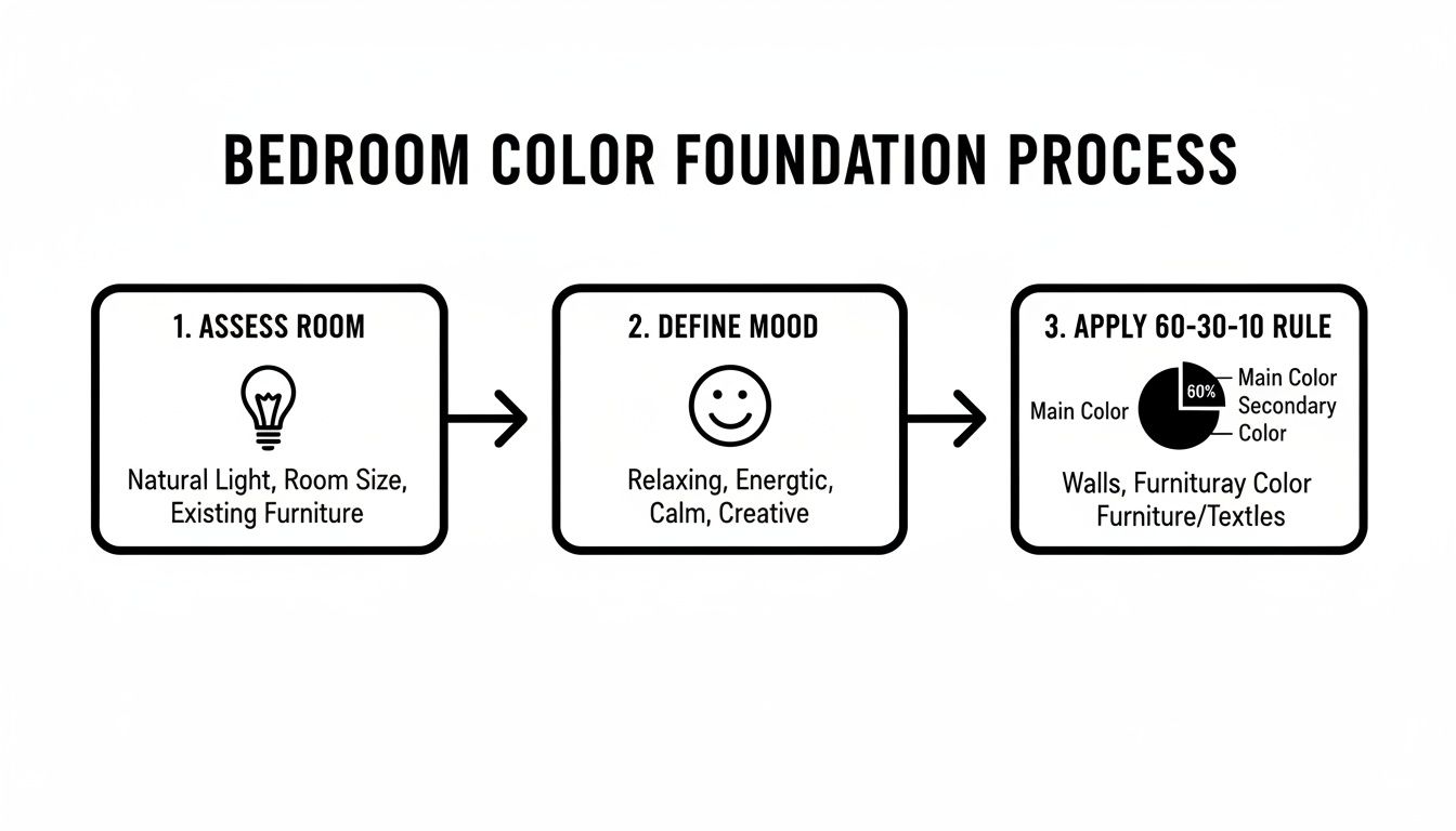
These three core steps act as your strategic plan, guaranteeing a cohesive look that feels like it was designed by a pro.
Define The Mood You Want To Create
Now for the fun part. How do you want your bedroom to feel? Are you dreaming of a serene, spa-like escape? A warm and cozy cocoon? Or maybe something more vibrant and energizing to help you wake up? The mood you want is your true north—it will guide every color decision you make from here on out.
Color psychology isn't just talk; studies show that the colors around us directly impact our well-being. By choosing colors intentionally, you are actively designing an environment that supports you. It's no surprise that palettes for 2025 are leaning heavily on hues like sage green and pale blue, which are known for their calming effects.
Here’s a quick guide to help you connect the feeling you want with the right color family.
Matching Mood To Color Family
This table is your tool for choosing a primary color family based on the atmosphere you want to create.
| Desired Mood | Recommended Color Family | Psychological Effect |
|---|---|---|
| Serene & Calming | Cools (Blues, Greens, Grays) | Promotes relaxation, tranquility, and peace. |
| Cozy & Warm | Warms (Reds, Oranges, Yellows) | Creates an inviting, comforting, and intimate space. |
| Spacious & Airy | Neutrals (Whites, Creams, Beiges) | Makes rooms feel larger, cleaner, and more open. |
| Dramatic & Bold | Deeps (Navy, Charcoal, Burgundy) | Adds sophistication, drama, and a sense of luxury. |
| Energizing & Fresh | Brights (Pinks, Aquas, Corals) | Evokes a feeling of joy, creativity, and vibrancy. |
Once you have a clear mood in mind, you can start exploring shades within that family with total confidence.
Your bedroom’s color palette is more than decoration—it's a powerful tool for shaping your environment and influencing your mood. Choosing colors that align with your desired atmosphere is the key to creating a space that truly feels like your own.
With your mood defined, you're ready to find the perfect shades to bring your vision to life. For a deeper dive into creating a harmonious look, you can explore An Expert's Guide to the Perfect Color Palette.
Finding a Personal Palette That Speaks to You
You've assessed your room's light and have a vibe in mind. Now for the fun part: finding a color palette that feels like you. This is where your vision starts to come alive, moving from abstract ideas to a concrete plan for a space you’ll genuinely love waking up in.
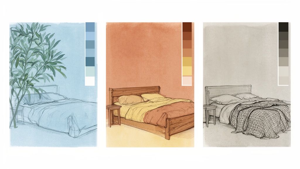
Serene and Calming Cool Palettes
If you're dreaming of a peaceful retreat, cool colors are your best ally. These are the hues that make you instinctively take a deep breath and relax.
- Soft Blues: Think sky blue or a muted periwinkle. These shades create a sense of spaciousness and calm, almost like bringing a clear, open sky indoors.
- Gentle Greens: Sage, mint, and soft seafoam green are incredibly grounding. They connect your bedroom to the tranquility of nature, promoting rest and balance.
- Subtle Lavenders: A hint of lavender or lilac adds a touch of sophisticated calm. It’s a peaceful color that doesn't feel overly sweet.
These colors provide the perfect canvas for minimalist, coastal, or modern decor styles, empowering you to create a crisp and airy sanctuary, especially in rooms that get a lot of natural light.
Warm and Inviting Color Schemes
Want a bedroom that feels like a cozy embrace at the end of a long day? Warm, earthy tones are the way to go. You can use these colors to instantly make a space feel more intimate and welcoming.
Rich terracottas, soft buttery yellows, and even deep, comforting browns can build an atmosphere that’s all about comfort. These hues are fantastic for rooms that might feel a bit chilly, like those with north-facing windows. Pair them with natural wood furniture and plenty of soft textiles to really amplify that cozy, sanctuary-like feeling.
**Your color choice is a personal statement.**Interestingly, research shows that preferences can differ, with one study finding that 76% of women lean toward warm tones and 54% of men favor cool ones. This just goes to show how important it is for you to pick a palette that feels right for who will actually be using the room.
Bold and Moody Jewel Tones
For anyone who loves a bit of drama and luxury, a bold, moody palette is a fantastic choice. You can use deep jewel tones—like emerald green, sapphire blue, or a rich burgundy—to create a sophisticated and enveloping space.
This approach works stunningly in larger rooms that can handle the color depth without feeling cramped. But don't rule it out for smaller spaces! A deep, moody color can create an intentional, cocoon-like effect that feels incredibly intimate. Just be sure to balance these intense shades with metallic accents like brass or gold and plush textures like velvet to really nail that opulent vibe. You can learn more about how these choices impact your well-being by digging into Bedroom Colour Psychology.
Feeling a little torn between all the possibilities? Take our quick and easy Bedroom Style Quiz. It’s a great way to discover your unique design personality and get recommendations tailored just for you.
How Furniture Choices Can Elevate Your Color Scheme
Think of your color palette as the foundation, but it's your furniture that truly brings the room's story to life. The right pieces don't just occupy space—they work with your colors to build depth, harmony, and personality. This is where you can turn a good design into an unforgettable one.
Your bed is the undeniable anchor of the entire design. Imagine a room with a warm, neutral color scheme. A solid wood bed frame instantly introduces a rich, grounding element, adding natural texture that keeps beige or cream walls from feeling flat. That one choice elevates the room from bland to beautifully intentional.
Creating Harmony with Upholstery and Finishes
Upholstered furniture is a fantastic tool for pulling your secondary colors into the design. In a calm, cool-toned bedroom with soft gray walls, a plush headboard in a deeper charcoal or navy creates a sophisticated focal point. It reinforces the serene mood while adding a welcome layer of comfort and luxury.
When it comes to dressers, nightstands, and other case goods, you have powerful choices:
- Blend Seamlessly: Choosing pieces with a finish that’s very close to your wall color creates a cohesive, almost built-in look. This trick can make a smaller room feel more spacious and uncluttered.
- Contrast Beautifully: Or, you can make a statement. A crisp white dresser popping against a deep navy wall, for instance, creates a dynamic and visually exciting effect that feels deliberate and high-end.
Your furniture is the ultimate tool for executing your design vision. Every piece, from the bed to the nightstands, should either support your dominant color or introduce a thoughtful accent, telling a cohesive story about your personal style.
Equipping You for Your Design Journey
We see you as the hero of your home’s story, and every hero needs the right tools. Here’s how you can choose the perfect bedroom set for your needs from trusted brands like Ashley and Flexsteel. These pieces are designed to help you build the perfect retreat you have in mind. Each piece is chosen for its ability to fit into a wide range of bedroom color scheme ideas.
As you browse, think about how different wood tones, metal accents, and fabric colors will play off your paint choices. For a deeper dive into making these critical decisions, you can use our expert advice on how to choose bedroom furniture that will serve you well for years. Your perfect bedroom is just a few choices away, and we're here to help you bring it to life.
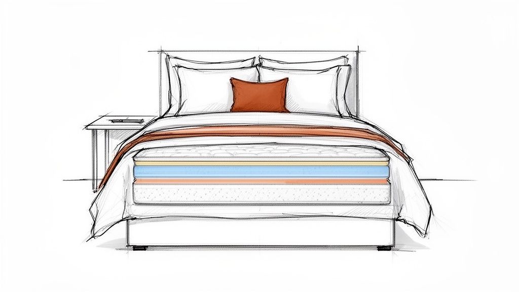
Tying It All Together with Bedding and Mattresses
Your paint is on the walls and the furniture is in place. You’ve set the stage, but the real star of any bedroom is, of course, the bed itself. This is where your color scheme truly comes to life. Your bedding is so much more than just a comfy place to land at night; it's a powerful design tool for layering in texture, pattern, and that final touch of personality.
Think of your duvet, shams, and throw pillows as the perfect spot to experiment with your 10% accent color from the 60-30-10 rule. Imagine a room with soft, sage green walls and a crisp white duvet—it instantly feels clean and serene. Now, add a single terracotta-colored accent pillow. Just like that, you’ve brought in a touch of warmth and a designer flair without disrupting the calm. It’s an easy, low-commitment way to make your color story feel complete.
The Foundation of Comfort: Your Mattress
While color sets the mood, the quality of your sleep is what really makes a bedroom a sanctuary. A gorgeous room doesn't mean much if you're tossing and turning all night on an old, unsupportive mattress. Investing in quality sleep is a direct investment in your well-being, impacting everything from your daily energy to your long-term health.
This is where finding the right fit is absolutely critical. You can take the guesswork out of the process with expert guidance.
Your mattress isn't just another piece of furniture; it's the functional heart of your bedroom. It supports your health day in and day out, making it the most important decision you'll make in creating your personal retreat.
Here's how you can choose the perfect mattress designed to fit every sleep style and preference imaginable.
With top brands in stock, you can be sure you'll find the ideal foundation to ensure your comfort truly matches your style.
Let's Find Your Perfect Sleep Solution
Choosing a mattress can feel overwhelming, but it doesn't have to be something you tackle alone. We’ve made it our mission to give you the expertise you need to make a confident choice. Our dedicated Sleep Experts use a high-tech bed matching system to identify your body's unique pressure points, allowing them to recommend the ideal mattress for your specific needs.
We want to arm you with the right information and technology so you can pick from trusted brands like Serta and Beautyrest with total peace of mind. Your dream bedroom is a blend of stunning style and deep, restorative comfort, and you have the power to create it.
Take a look at our collection of high-quality mattresses online, or better yet, come in and let our experts help you get custom-fitted for the best sleep of your life.
Bringing Your Vision to Life: A Practical Checklist
Alright, you’ve done the fun part—you’ve gathered ideas and picked a color palette you love. Now, let's bridge the gap between that vision and the finished room. A little planning here will save you a world of headaches (and potential re-dos) later.
Taking a few deliberate steps now ensures you can move forward with total confidence. It’s all about making sure your brilliant ideas work just as well in your actual space as they do in your head.
Test Your Paint Colors in the Real World
If I can give you one piece of non-negotiable advice, it's this: never trust a tiny paint chip. The color that looked perfect under the harsh fluorescent lights of the hardware store can transform into something completely different once it's in your bedroom. Light is everything when it comes to color.
Here’s the only foolproof way for you to avoid a paint-day surprise:
- Grab a Few Samples: Buy sample pots of your top two or three contenders. Don't skip this!
- Paint Big Swatches: Get that paint on a poster board or directly on the wall. I’m talking a big swatch, at least 2×2 feet, so you can actually see it.
- Watch It All Day: Move your painted boards to different walls. Check them in the morning, at high noon, and as the sun goes down. You'll be amazed at how a color can shift from warm and inviting to cool and subdued.
A color with a low Light Reflectance Value (LRV) will feel intensely saturated in a sunny room, while a high LRV color might look washed out. Testing is the only way to truly know how the paint will behave with your specific lighting.
Map Out Your Furniture Layout
Before the delivery truck arrives, get a feel for your new layout. You don't need fancy software—just a roll of painter's tape and a measuring tape.
Mark out the dimensions of your bed, dresser, and nightstands right on the floor. This simple trick is a game-changer. It lets you walk the space and answer crucial questions. Is there a clear path around the bed? Can you open the closet door all the way? Will your dresser drawers hit the nightstand? This little bit of prep work ensures your final layout is as functional as it is beautiful.
Pulling a room together can feel like a big project, but you don't have to go it alone. Our expert design staff in Lubbock, Hobbs, and Ruidoso Downs are here to be your partners. We can help you nail down those final details with professional insight, giving you the confidence to create a bedroom you'll absolutely love for years to come.
Answering Your Top Bedroom Color Questions
Once you start narrowing down your bedroom color ideas, a few key questions almost always come up. It's totally normal to second-guess things before you break out the paint rollers! Let’s tackle some of the most common concerns to help you move forward with confidence.
Should My Bedroom Be Light or Dark?
This is the big one, and the right answer comes down to the room itself and the feeling you’re after. There’s no single right choice, just the right choice for your space.
- Go Light If… your bedroom is on the smaller side or doesn't get a ton of natural light. You can use lighter colors to bounce light around a room. Think soft grays, creamy whites, or pale blues. They have a wonderful way of making a space feel bigger, brighter, and more open.
- Go Dark If… you have a larger room that you want to feel more intimate and cozy. Deep, moody colors like navy, charcoal, or a rich emerald green absorb light, which creates a snug, cocoon-like atmosphere. It’s a bold move that can feel incredibly sophisticated and is perfect for crafting a true sanctuary.
How Many Colors Is Too Many?
It's easy to fall in love with a dozen different shades, but the key to a restful bedroom is avoiding visual chaos. A great tool you can use is the 60-30-10 principle we covered earlier. It just works.
Generally, sticking to three, maybe four, well-coordinated colors is the sweet spot. This usually breaks down into your main wall color, a secondary color for furniture or bedding, and then one or two accent shades for the fun stuff. Any more than that, and the colors start competing with each other instead of working together.
Remember, the goal is a harmonious space, not a complex one. A thoughtfully limited palette gives every color a clear job to do, creating a cohesive room that feels intentional and calm.
What if I Want to Use a Really Bold Color?
Go for it! A splash of a bold, saturated color is one of the best ways to let your personality shine. You don't have to drench the entire room in a wild hue to make a statement.
Here are a few ways you can work in that daring shade you love:
- The Accent Wall: It's a classic for a reason. Painting just the wall behind your headboard in a dramatic color creates an instant focal point without overpowering the room.
- Color Drenching: For the truly adventurous, this modern technique involves painting the walls, trim, and sometimes even the ceiling all in the same bold color. It's an immersive approach that feels incredibly chic and purposeful.
- Pop It in the Decor: The easiest way to play with bold color is through your "10%" accents. Think a vibrant velvet headboard, a set of electric throw pillows, a colorful piece of art, or a statement area rug. It adds all the excitement with none of the long-term commitment of paint.
Think of choosing a color scheme as a personal journey. You're crafting the backdrop for your own life, and our job is to give you the expert advice and tools to do it beautifully.
At Miller Waldrop Furniture & Decor, we believe that creating your perfect bedroom should be an exciting and joyful process. Our design team is here to guide you through every choice, from the ideal paint color to the furniture that pulls it all together. Let's build your dream sanctuary. Find endless inspiration by exploring our collections at https://www.millerwaldrop.com.