Amazing Big Wall Art Ideas to Elevate Your Home

You finally finish the sofa styling, set the lamps, straighten the rug, and then your eye goes straight to the one thing still unresolved. A wide, empty wall with too much visual weight and no clear answer. That hesitation is normal. Large walls are expensive to fill, easy to misjudge, and hard to redo once the holes are in place.
Big wall art works when it solves a room problem, not just a wall problem. One wall may need a strong focal point to anchor the seating area. Another may need texture to soften sharp furniture lines. A third may need function, with shelving or a display system that adds storage while still looking considered.
That is the part many roundups skip. Choosing the right idea is only half the job. Scale, placement height, spacing, color balance, and the relationship to nearby furniture are what make wall art feel intentional instead of random. A beautiful piece can still look wrong if it is too small, hung too high, or paired with finishes that fight the room.
Interest in wall decor has grown for a reason. Homeowners are treating it as part of the room plan, not the final accessory added in a rush. I see the difference in finished spaces all the time. The right wall treatment can make a sofa feel properly sized, help a bed wall hold its own, and give an open-concept room a stronger sense of structure.
If you are staring at the wall above a sofa, bed, dining buffet, or hallway bench, use this guide as a decision tool. These 10 ideas are not just inspiration. They are options with clear use cases, style pairings, and execution notes so you can choose with confidence and put the right piece in the right place the first time.
1. Modern Gallery Wall with Curated Art Collections
A gallery wall is one of the smartest big wall art ideas when you want personality without committing to one oversized piece. It works especially well in living rooms over sofas, in bedrooms above dressers, and along stair-step walls where a single canvas can feel awkwardly isolated.
The trick is restraint. A gallery wall looks polished when the pieces relate to each other through color, subject, frame finish, or spacing. It looks chaotic when every piece is trying to be the star.
What works on a large wall
If your sofa has strong lines, like many modern or transitional silhouettes, use a tidy grid or a controlled salon arrangement. If the furniture is softer or more traditional, you can loosen the layout a bit and mix frame sizes more freely.
A gallery wall also solves a common family-home problem. You can blend personal photos, scenic prints, sketches, and even one textile piece so the wall feels designed instead of sentimental in a scrapbook way.
Practical rule: Keep the gaps between frames consistent. Tight spacing usually looks more expensive than wide spacing.
Best pairings and common mistakes
Gallery walls pair well with grounded upholstery and simple tables because the wall already carries visual complexity. Think a clean-lined sectional, a neutral sofa, or a wood media console with modest styling.
A few things help:
- Build on the floor first: Arrange everything before you make holes.
- Use paper templates: Tape them to the wall to test scale and spacing.
- Repeat one finish: If you mix black, wood, and brass frames, repeat each finish at least once so it looks intentional.
What doesn't work? Tiny frames scattered across a huge wall. If the wall is large, the collection itself needs visual mass. Group the pieces tightly enough that they read as one composition, not a dozen unrelated stops.
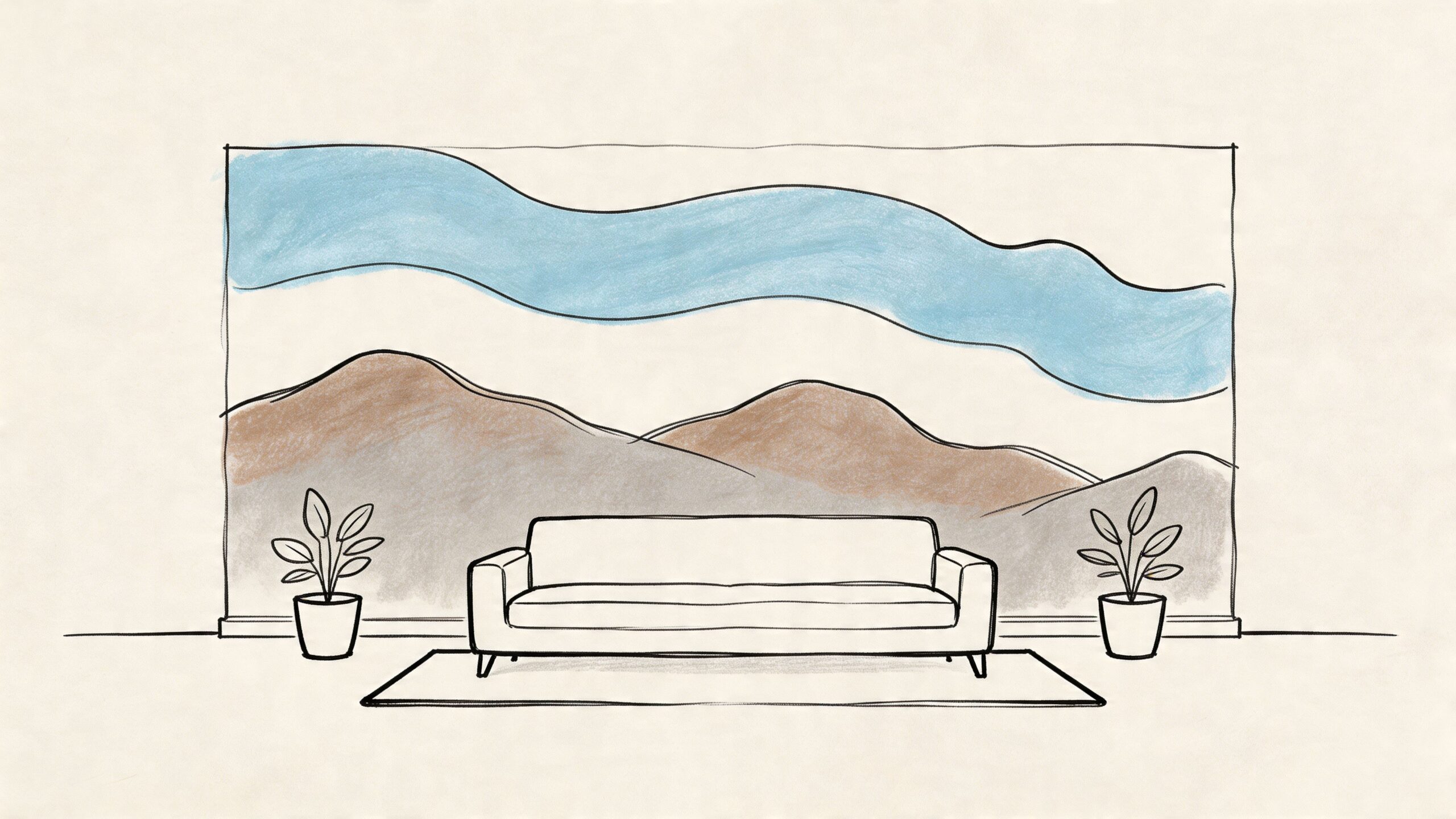
2. Large-Scale Mural Artwork and Wall Paintings
You walk into the room, the sofa is in place, the rug works, and the wall still feels unfinished. That is usually the moment a mural earns its place. Instead of adding one more object to the room, it gives the architecture a point of view.
Murals work best when the wall needs to carry real visual weight. A long living room wall, a bed wall with extra height, or a dining area that feels flat can all benefit. In those cases, framed pieces often read as separate objects. A mural reads as part of the room itself.
When a mural is the right answer
Choose a mural when scale is the main problem. If the wall is so tall or wide that traditional art looks undersized, one continuous composition usually solves it faster and more cleanly. If that is your challenge, these ideas for decorating walls with high ceilings will help you judge proportion before you commit.
Placement matters as much as subject. Over a bed, the mural should stay centered on the bed width, not just the full wall. Behind a sofa, let the main visual focus sit within the width of the furniture so the room feels anchored. On a dining wall, wider and calmer artwork tends to work better than a mural with one busy focal point off to the side.
I usually steer clients toward designs that borrow from the region without turning the room into a theme. Soft botanicals, horizon-inspired abstracts, weathered neutrals, and oversized tonal patterns hold up well over time. Highly literal scenes can feel dated faster, especially once you change upholstery, lighting, or rugs.
Style pairings that keep it balanced
A mural asks the rest of the room to show some restraint.
These pairings tend to work well:
- Botanical mural with fitted seating: Good for softening square-armed sofas and structured beds.
- Abstract mural with simple upholstery: Lets color and movement come from the wall instead of every surface in the room.
- Textural mural with wood furniture: Adds depth without forcing a strong pattern mix.
There are trade-offs. Hand-painted murals give you the most customization and the richest finish, but they cost more and take longer. Peel-and-stick mural panels are easier to install and replace, but they need a smooth wall and careful alignment to look polished. If you are choosing between them, start with how permanent you want the decision to be.
The mistake I see most often is treating a mural like a background. Once the wall has that much presence, the room needs fewer competing moments. Skip the ornate lamp pair, the loud accent pillows, and the heavily patterned rug all at once. Let one surface lead, and the whole room feels more confident.
3. Oversized Canvas Prints and Large-Format Photography
If you want a clean, strong answer to an empty wall, oversized canvas is hard to beat. One large piece can anchor a sofa, center a bed, or bring order to a room that feels like it has too many moving parts.
This is the option I reach for when the furniture already has presence. A substantial sectional, a tufted bed, or a long dining buffet often needs one confident art choice above it, not six smaller decisions.
Choosing the right subject
Scenic photography, abstract color fields, black-and-white architectural prints, and painterly neutrals all work well at scale. The best subject depends on what the room lacks.
If the room feels cold, choose art with warmth and movement. If the room feels visually busy, choose simpler imagery with one dominant focal area. If the furniture is dark and weighty, a lighter-toned piece can lift the whole composition.
Large photography works best when the image reads clearly from across the room. Fine detail is nice up close, but shape and contrast matter more at everyday viewing distance.
Good scale versus bad scale
A single oversized canvas should feel related to the furniture under it. Too small and it floats. Too big and it looks jammed in.
Good oversized art usually:
- Leaves side margins: You want visible wall space at both ends.
- Connects to the furniture width: It should visually belong to the piece below.
- Has enough height: On a tall wall, a short horizontal piece can look timid.
One practical product option is the Black/Silver Highland Cow Canvas at Miller Waldrop Furniture & Decor. It's a strong fit for rustic, ranch, and modern farmhouse spaces, especially where leather seating, weathered wood, or warm neutrals already set the tone.
What doesn't work here is weak printing or a low-resolution image stretched too large. Big art magnifies quality issues fast.
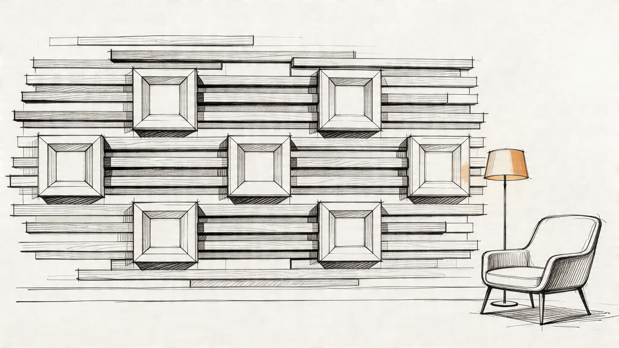
4. Textured Wall Art and 3D Wall Installations
When a room looks flat, texture usually solves it faster than color. That's why dimensional wall art can be more effective than another framed print, especially in neutral spaces.
Textured pieces also help when you want a wall to feel finished without introducing more pattern. Wood slats, plaster relief panels, woven forms, carved wall hangings, and sculptural installations all create interest through light and shadow instead of busy imagery.
Where texture shines
This is a strong choice behind a sofa, above a credenza, or on the wall opposite windows where changing daylight can highlight the depth. In bedrooms, textured art can soften the harder lines of case goods and make the room feel quieter.
If you're drawn to dimensional pieces, Miller Waldrop's thoughts on 3-D wall sculptures are useful for understanding how sculptural art changes a room differently than flat prints. And if you like a more playful statement, this look at oversized foam flower wall art shows how dramatic scale and texture can work together.
Trade-offs to think through
Textured art is beautiful, but it isn't always low-maintenance. Dust collects more easily on deep surfaces, and highly delicate pieces aren't ideal in busy family walkways or tight dining areas where chairs bump walls.
Keep these pairings in mind:
- Wood texture with leather or performance fabric seating: Warm and grounded.
- Soft sculptural pieces with clean-lined furniture: Adds depth without heaviness.
- Metal-and-fabric mixes with transitional rooms: A good bridge between classic and modern.
What usually misses is putting heavily textured art on an already complicated wall with brick, stone, or aggressive wallpaper. One textured statement is plenty. Two often compete.
5. Floor-to-Ceiling Wallpaper and Pattern Installations
You stand back, look at a big blank wall, and framed art still feels too small. Floor-to-ceiling wallpaper solves a different problem. It gives the entire wall a point of view, so the room feels finished in one move instead of assembled piece by piece.
Used well, wallpaper reads more like a design layer than a decoration. It can soften a tall bedroom wall, bring rhythm to a long hallway, or give an open living area a clear focal zone without adding extra furniture. That makes it one of the smartest big wall art ideas for rooms that need scale and structure at the same time.
Where wallpaper earns its keep
Wallpaper works especially well behind a bed, in a dining area, along an entry corridor, or on a living room wall that feels too broad for one artwork to carry. In open-concept homes, it can also define a sitting area or dining zone without breaking up the floor plan.
Prep matters here. Old paper, patched drywall, and textured surfaces all affect the final result. If you're sorting through an older wall condition, this guide on whether you can put wallpaper over wallpaper lays out what to check before you commit.
How to choose a pattern that still looks good in three years
The safest long-term choices usually fall into three groups. Tonal patterns. Organic motifs. Architectural repeats. Each gives you movement, but they age better than novelty prints or small, high-contrast motifs stretched across a large surface.
Use this framework before you order samples:
- Large walls with low furniture: Choose a pattern with enough scale to hold the wall. Tiny repeats often look busy and underpowered.
- Rooms with patterned rugs or bold upholstery: Keep the wallpaper quieter and more tonal.
- Clean-lined furniture: Subtle geometrics or linear patterns usually pair well.
- Traditional or collected rooms: Organic prints and softer repeats feel more natural.
- Spaces with limited daylight: Avoid very dark grounds unless you want a moodier room on purpose.
One rule I use often is simple. The stronger the furniture silhouettes and textiles, the calmer the wall should be.
Trade-offs to plan for before installation
Wallpaper can cover a lot of visual ground, but it is less forgiving than framed art. Pattern misalignment shows. Outlet placement matters. Ceilings that are out of level become more obvious with stripes or rigid geometrics.
That does not mean you should avoid it. It means the execution matters as much as the pattern selection.
A few combinations tend to work well:
- Botanical or vine patterns with upholstered beds and warm wood tones: Soft and layered.
- Textural grasscloth-look papers with modern case goods: Quiet depth without obvious imagery.
- Architectural prints with custom sofas and metal accents: Crisp and structured.
The common miss is scale confusion. A tiny print on a two-story wall, paired with busy drapery and patterned accent chairs, creates visual noise fast. On a large wall, one confident pattern usually does more than several competing ones.
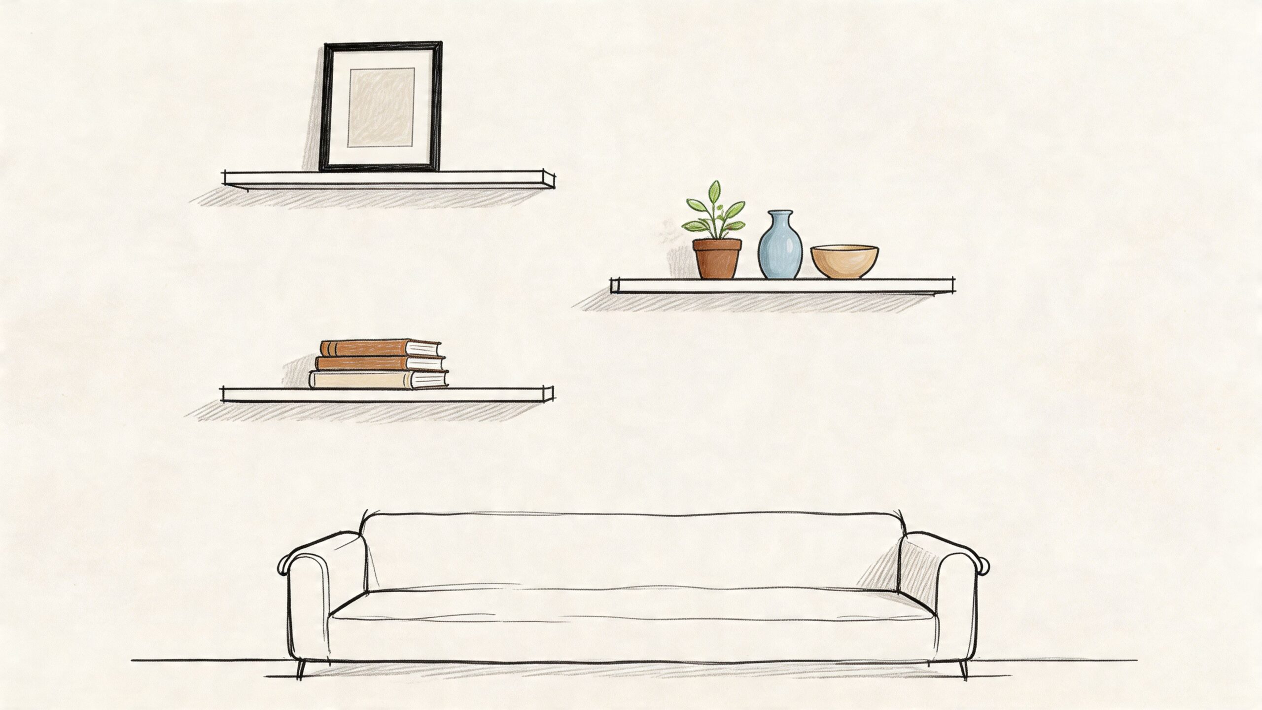
6. Floating Shelf Displays and Wall-Mounted Collections
Some blank walls need art. Others need function with personality. Floating shelves do both.
This approach is ideal when you want your wall to evolve over time. It's especially useful in family rooms, home offices, bedrooms, and apartments where one fixed art piece may feel limiting. Shelves let you layer framed art, books, pottery, baskets, small plants, and meaningful objects without committing to a single permanent composition.
Why shelves work in real homes
A shelf wall is forgiving. You can restyle it seasonally, swap in new family photos, or pull back the styling if it starts to feel crowded. That flexibility matters, especially if your space serves more than one purpose.
For renters, shelves aren't always the easiest choice, but for homeowners they're often a practical answer to large walls that need both storage and style. They can also help bridge awkward spaces around fireplaces, desks, or media units.
Styling so it doesn't look cluttered
The biggest mistake with floating shelves is treating every inch like display space. Good shelf styling uses negative space the same way good art placement does.
A cleaner arrangement usually includes:
- A few larger anchors: Framed art, stacked books, or taller ceramics.
- Different heights: So the eye moves naturally.
- Repeated tones: Black, wood, linen, brass, or one accent color to tie everything together.
I like this approach in homes where the furniture is already substantial. A broad sofa, bookmatched dining table, or upholstered bed can handle the visual layering.
What doesn't work is filling shelves edge to edge with small objects. That turns a design feature into storage on display.
7. Metal Wall Art and Architectural Sculptures
A large wall can look finished on paper and still feel flat in person. Metal art solves a different problem than canvas does. It adds structure, shadow, and a sharper edge, which is why I reach for it when a room needs definition more than color.
This category covers laser-cut panels, forged forms, gridded compositions, hammered discs, and wall-mounted sculpture. The finish changes the mood fast. Blackened steel feels architectural. Brass and antique gold read warmer. Mixed-metal pieces can tie together lighting, hardware, and furniture bases if those finishes already exist in the room.
Best rooms and best pairings
Metal wall art works best where the furniture has clear lines and some visual weight. Living rooms with clean-lined sectionals, dining rooms with substantial tables, and home offices with case goods or darker wood usually handle it well.
Placement matters here. On a sofa wall, the piece should usually span about two-thirds to three-quarters of the sofa width so it holds the wall without looking undersized. In a dining room, center it at standing eye level if the wall is mostly viewed while moving through the space, or slightly lower if it sits behind a buffet.
Style pairing matters just as much:
- Modern and contemporary rooms: Linear grids, asymmetrical sculpture, matte black finishes
- Rustic or organic spaces: Hammered surfaces, aged metals, softer curves
- Transitional rooms: Simpler silhouettes with warmer finishes such as bronze or antique brass
If you want inspiration before choosing a direction, this collection of landscape wall art is useful for comparing how strong wall statements shift the tone of a room, even though the material is different.
What to watch before buying
Installation is part of the design decision. Some metal pieces are heavy, project several inches off the wall, or need exact spacing between panels. If the wall gets strong daylight, openwork designs can cast beautiful shadows, but glossy finishes may throw glare at the wrong time of day.
A few trade-offs are worth checking before you buy:
- Open designs need breathing room: They get lost against busy wallpaper or cluttered furnishings.
- Reflective metal shows more light variation: Good in dim rooms, harder opposite large windows.
- Fine, delicate patterns disappear on oversized walls: Bigger walls need thicker lines, larger shapes, or grouped panels.
The biggest mistake is scale. A thin, intricate piece can look substantial online and still vanish once it's hung over a 9-foot sofa or across a two-story wall. If the room needs a focal point, choose metal art with real mass, deeper relief, or a multi-panel arrangement that gives the eye something to hold onto.
This is also one of the easiest categories to pair with architectural details. It works especially well near stone fireplaces, plaster walls, wood slat treatments, and rooms with strong vertical lines. If you want wall art that feels built into the room rather than just placed on it, metal is often the stronger choice.
8. Nature-Inspired Botanical and Landscape Wall Murals
You have a big wall that feels blank by day and heavy at night. Nature-based murals and oversized botanical pieces solve that problem differently than metal or abstract art. They soften the room, add depth, and give the eye a place to settle.
This category covers oversized scenic canvases, panoramic photography, botanical wallpaper, and full-wall murals. The best choice depends on what the wall needs to do. A distant horizon effect can make a tight room feel longer. A close-up botanical pattern can warm up a tall wall that feels stark. A misty forest or coastal image can quiet a room with hard lines and large furniture.
Why this style keeps working
Nature imagery usually blends easily with the materials people already have at home. Wood tones, linen, boucle, leather, stone, matte black, and warm metals all sit comfortably with it. That range makes it one of the safer choices when you want presence without committing to something highly graphic or trend-driven.
It also gives you more control over mood than many homeowners expect.
Soft botanicals read gentle and decorative. Large-scale tree canopies or mountain views feel immersive. Coastal scenes open up darker rooms. Desert imagery adds warmth without adding visual clutter. If you want ideas that compare rustic, minimal, and classic approaches, this roundup of landscape wall art is a useful reference point.
How to choose the right version for your wall
Start with viewing distance. If the sofa or bed sits close to the wall, use simpler imagery with larger forms. Fine branches, tiny leaves, or busy panoramic detail can turn muddy when seen from six feet away. If the room gives you more distance, layered scenery and atmospheric photography have room to breathe.
Scale matters just as much. For a mural behind a sofa, the composition should usually span at least two-thirds of the furniture width. On a two-story wall, choose imagery with strong shape contrast so it still reads from across the room. Small, delicate motifs disappear fast on oversized surfaces.
Style pairing is where this category either looks refined or overly themed. Pull one or two colors from the mural into a rug, pillow, chair, or drapery fabric. Then stop. Repeating leaf prints, branch accessories, and faux natural objects around the room usually weakens the effect instead of strengthening it.
A good nature-based artwork should support the room's mood, not turn the room into a set.
The trade-off is specificity. A dramatic forest mural makes a stronger statement than a neutral abstract, but it also narrows your future furniture choices. If you like to change rugs, accent colors, or upholstery often, choose a quieter palette and softer subject matter. If the room needs a clear focal point and your furnishings are staying put, a full-wall botanical or scenic piece can be the right commitment.
9. Abstract and Geometric Wall Art Collections
Abstract art is often the best answer when you want impact without narrative. It lets color, motion, and composition do the work, which is useful in rooms where personal photos or representational scenes would feel too specific.
This category is especially strong in modern, transitional, and eclectic homes. It can sharpen a neutral room, connect several colors that already exist in the space, or add movement to furniture with simple silhouettes.
Picking the right kind of abstract art
Not all abstract art behaves the same way. A loose painterly piece feels very different from a crisp geometric composition. One softens. The other structures.
Use painterly abstracts when the room needs energy or warmth. Use geometric pieces when the room already has discipline and you want the wall to reinforce it.
Try these pairings:
- Painterly abstract with a plush sofa: Soft, layered, inviting.
- Geometric art with angular furniture: Crisp and architectural.
- Monochrome abstract with mixed textures: Quiet but refined.
What gives abstract art staying power
Scale and palette matter more than trend here. If the piece picks up colors already used in the room, it feels integrated. If it introduces a completely unrelated palette, it can look borrowed from another house.
Abstract art also gives you flexibility if you expect furniture changes later. Representational art can feel tied to one mood. A strong abstract usually survives a rug swap, a sofa upgrade, or a paint change more gracefully.
What tends not to work is buying abstract art only because the colors match. Matching isn't enough. The composition still needs enough presence to hold the wall.
10. Personalized Family Photo Walls and Memory Displays
A family photo wall can be beautiful, but it needs editing. That's the difference between a feature and a collage of everything you've ever printed.
This idea works best when the photos are treated with the same discipline you'd use for art. Consistent framing, a clear color story, and a defined layout help memory walls feel intentional. That matters in entryways, upstairs halls, bonus rooms, and living spaces where you want warmth without visual clutter.
How to make it feel designed
Start with a unifying choice. Black-and-white photos, warm-toned prints, identical mats, or one frame finish all help. Then mix image types. Include portraits, candid moments, travel memories, and a few wider shots so the wall doesn't become a row of similar faces.
A memory wall is also a strong answer for homes that don't want generic store-bought art. It tells your story and gives a room emotional weight.
Best uses and one caution
I like photo walls most in transitional spaces and secondary gathering areas. They add intimacy without demanding the same visual authority as a major statement piece over the main sofa.
A few smart moves:
- Choose your strongest images: More isn't better.
- Print at varied scales: One or two larger anchors help.
- Leave room to grow: Save a little space for future additions.
What doesn't work is mixing vacation snapshots, kids' school photos, and random frame styles in no particular order across a formal main wall. If you want the room to feel polished, curate first and sentimentalize second.
10-Point Big Wall Art Comparison
| Item | 🔄 Complexity | ⚡ Resources | ⭐📊 Expected outcomes | 📍 Ideal use cases | 💡 Key advantages |
|---|---|---|---|---|---|
| Modern Gallery Wall with Curated Art Collections | Medium, careful planning & multiple hang points | Low–Medium, multiple frames, hanging hardware, time | ⭐⭐⭐ 📊 Personalized, textured focal wall; flexible updates | Living rooms, bedrooms, home offices, dining areas | Affordable, highly customizable, renter‑friendly |
| Large-Scale Mural Artwork and Wall Paintings | High, design + professional installation often required | High, custom paint/print, installation (≈ $500–$5,000+) | ⭐⭐⭐⭐ 📊 Dramatic, room‑defining statement; changes room scale | Living rooms, master bedrooms, entryways, accent walls | Bold transformation; can visually expand space; removable options exist |
| Oversized Canvas Prints and Large-Format Photography | Low–Medium, single installation, may need reinforcement | Medium, professional printing, framing or mounting ($200–$2,000+) | ⭐⭐⭐⭐ 📊 Single impactful statement; gallery‑quality finish | Above sofas, beds, dining areas, home offices, entryways | Clean, low‑clutter impact; customizable with photos or art |
| Textured Wall Art and 3D Wall Installations | High, structural considerations and pro install common | High, materials, custom fabrication, lighting ($1,000–$10,000+) | ⭐⭐⭐⭐ 📊 High tactile/architectural impact; adds depth and acoustic benefits | Modern living rooms, feature walls, lofts, showrooms | Creates depth/shadow play; integrates with lighting and architecture |
| Floor-to-Ceiling Wallpaper and Pattern Installations | Medium–High, precision matching and alignment needed | Medium–High, material cost, possible pro install ($1,000–$3,000+) | ⭐⭐⭐⭐ 📊 Immersive room identity; hides imperfections, versatile finishes | Master bedrooms, dining rooms, living areas, entryways | Vast pattern selection; removable options for renters; quick aesthetic update |
| Floating Shelf Displays and Wall-Mounted Collections | Medium, secure anchoring and thoughtful styling required | Low–Medium, shelving, anchors, decor pieces ($200–$1,500) | ⭐⭐⭐ 📊 Functional display that personalizes space and adds storage | Living rooms, home offices, bedrooms, entryways, bathrooms | Combines function + display; easy to refresh and rearrange |
| Metal Wall Art and Architectural Sculptures | High, heavy pieces need reinforcement & pro mounting | High, metal fabrication, finishes, possible reinforcement ($1,000–$15,000+) | ⭐⭐⭐⭐ 📊 Durable, contemporary architectural focal point | Living rooms, home offices, entryways, feature walls | Long‑lasting, strong visual architecture; pairs with integrated lighting |
| Nature-Inspired Botanical and Landscape Wall Murals | Medium–High, careful color and scale coordination | Medium–High, custom prints or painting ($500–$5,000+) | ⭐⭐⭐⭐ 📊 Calming, restorative environments; visually expands space | Bedrooms, living rooms, home offices, bathrooms, entryways | Timeless, biophilic appeal; pairs well with natural materials |
| Abstract and Geometric Wall Art Collections | Low–Medium, single or multi‑panel options, scale matters | Wide range, from affordable prints to high‑end originals | ⭐⭐⭐⭐ 📊 Modern, versatile focal point; adaptable to palettes | Living rooms, bedrooms, home offices, entryways, hallways | Flexible color/scale choices; creates gallery‑quality look |
| Personalized Family Photo Walls and Memory Displays | Medium, curation, consistent editing, and layout planning | Low, printing/framing costs; DIY or pro framing options | ⭐⭐⭐ 📊 Deeply personal focal point; easily updated over time | Living rooms, bedrooms, family rooms, entryways, home offices | Affordable, emotionally meaningful, highly customizable |
Your Vision, Brought to Life
You move the sofa into place, step back, and the wall still feels unfinished. That usually means the room needs more than decoration. It needs a clear decision about scale, placement, and how the art relates to the furniture.
By now, you likely know which direction fits your home: one oversized piece, a grouped arrangement, a textured installation, or a personal display. The next step is execution. Good results come from matching the wall treatment to the room's proportions, the visual weight of the furniture, and the mood you want the space to hold every day.
Start with the anchor piece in the room. If the sofa is long and low, a small framed print will look lost above it. If the bed has a tall upholstered headboard, a busy gallery wall can make the whole setup feel crowded. Shelves add flexibility, but they also introduce visual motion, which works well in active family spaces and less well in rooms meant to feel quiet and settled.
This is the part many homeowners miss. Big wall art works best when you treat it like part of the floor plan, not an accessory added at the end.
There are more wall art options available than ever, as noted earlier. The hard part is not finding something attractive. The hard part is choosing a size, format, and finish that fits your room and then installing it at the right height.
If you're refining a living room wall, start with the furniture anchor first. The right seating gives art context. You can explore Miller Waldrop's collection of Living Room Furniture to find sofas, sectionals, and accent chairs that support the look you're building instead of competing with it. In homes with a rustic, ranch, or collected style, one well-scaled statement piece can often finish the room more effectively than several smaller accents.
If you're in Lubbock, Hobbs, or Ruidoso Downs, extra guidance can save time and prevent expensive sizing mistakes. Miller Waldrop Furniture & Decor has served these communities for over 70 years, and its team offers complimentary design services, custom order options, and practical help connecting wall decor to the furniture, scale, and layout of the room.
Quick FAQ on Installation & Measurement:
- How high should I hang my art? Hang a single piece so its center sits about 57 to 60 inches from the floor. Above a sofa, console, or bed, leave 6 to 8 inches between the furniture and the bottom of the art so the two read as one composition.
- How big should my art be? Over a sofa, art usually looks right at about two-thirds to three-quarters of the sofa's width. On a large blank wall, map the size with painter's tape first. That simple step helps you judge width, height, and breathing room before you commit.
- How do I choose between a single piece and a gallery wall? Choose a single large piece if you want a strong focal point and a calmer look. Choose a gallery wall if you want more personality, more layering, and the option to add to it over time. The right answer depends on how much visual activity the rest of the room already has.
If you're ready to turn that blank wall into a finished room, Miller Waldrop Furniture & Decor gives you practical tools to do it. Browse furniture and decor online, visit a showroom in Lubbock, Hobbs, or Ruidoso Downs, or use their complimentary design services to match wall art with the right sofa, sectional, bed, or dining piece for your home.