How to Choose a Color Palette for Your Living Room You’ll Love

Choosing the right color palette for your living room is about so much more than just picking a paint color. It’s the single most impactful decision you'll make, setting the entire mood for the space where you and your family will gather, relax, and make memories. A thoughtfully chosen palette turns a room into a retreat that feels completely, uniquely you.
Your Guide to a Living Room You Will Love
The idea of selecting a whole color scheme from scratch can feel pretty intimidating, but it doesn't have to be. Let's reframe this from a stressful chore into a creative journey. You have the vision, and this guide is designed to give you the practical, confidence-boosting tools you need to pick colors that bring that vision to life.
With decades of experience helping families across West Texas and Southeastern New Mexico design their homes, we've seen firsthand how the right combination of colors can absolutely transform a space. This isn't about chasing fleeting trends; it's about empowering you to create a beautiful, timeless backdrop for your life.
The Power of a Balanced Palette
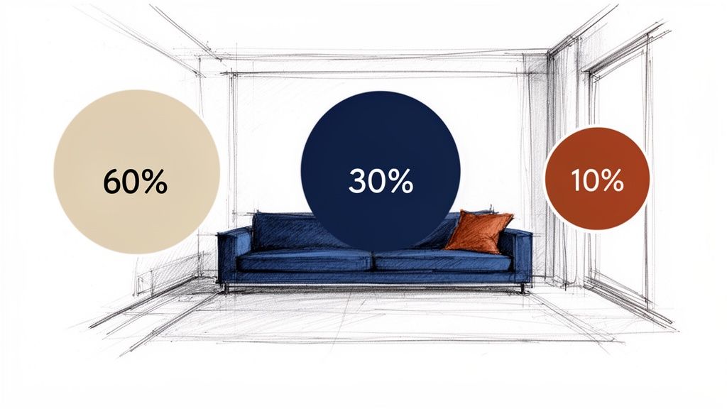
So, where do you start? Designers often rely on a simple, almost foolproof guideline to keep a room from feeling chaotic: the 60-30-10 rule. Think of it as a recipe for a perfectly balanced room. It gives you a clear structure for distributing your colors so the final look feels cohesive and intentional.
This simple rule of thumb takes the guesswork out of the process, making it much easier to manage. To help you visualize how this comes together, we've broken it down in the table below.
The 60-30-10 Color Rule Explained
A simple framework to help you balance your living room color palette. This rule provides a clear structure for distributing colors throughout your space for a cohesive look.
| Percentage | Color Role | Where To Use It |
|---|---|---|
| 60% | Dominant Color | Walls, large area rugs, and major furniture pieces like a large sectional. |
| 30% | Secondary Color | Accent chairs, curtains, an accent wall, or painted furniture. |
| 10% | Accent Color | Throw pillows, blankets, artwork, lamps, and small decorative objects. |
Essentially, the rule ensures you have a main color to ground the space, a secondary color to add interest, and a third to provide that little spark of personality. It's a fantastic starting point for any project.
From Inspiration to Execution
As we move through this guide, you’ll see exactly how to analyze your room, define the atmosphere you want, and use this principle to choose your colors. For example, you can create the perfect 60% base with a foundational piece, like a versatile neutral sofa from our curated furniture collection. This allows you to easily update your 10% accent colors through pillows and throws as seasons or your tastes change.
This isn't about sticking to rigid rules; it's about giving you the tools to make smart, informed decisions. The goal is to create a cohesive living room where your family can truly unwind and connect.
Ready to start your design journey? The expert team at Miller Waldrop is here to provide the tools and guidance you need to translate your color ideas into a beautiful, functional living space. Let's work together to create a home you'll be proud of for years to come.
Assess Your Space and Define the Mood
Before you even dream of picking up a paint swatch, your most powerful tool is simply observation. The true starting point for a successful color palette for your living room isn’t in a can of paint; it’s in the unique character of your room, shaped by its architecture and the light it receives throughout the day.
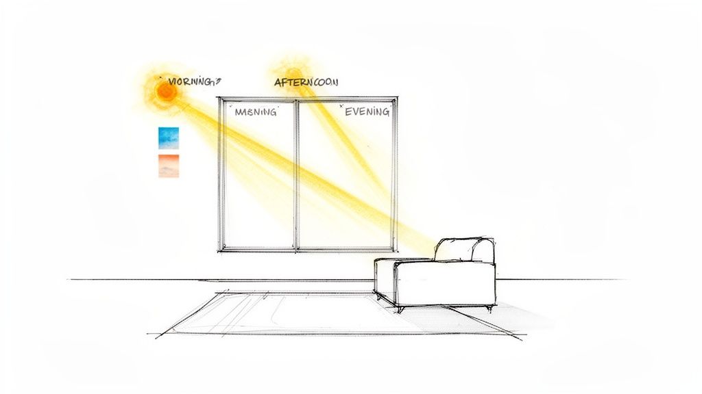
The high-desert light we get here in West Texas and Southeastern New Mexico has a special quality. The way it filters into your living room will completely change how colors look on your walls. A room that feels expansive and bright at noon might seem smaller and more shadowed by late afternoon.
Understand Your Natural Light
The direction your windows face isn't a small detail—it's one of the most critical factors that determines which colors will truly shine in your space.
- North-Facing Rooms: These rooms get consistent, indirect light that often has a cool, blueish cast. You can balance this by leaning into warmer colors. Think creamy whites, cozy greiges, or even soft yellows to make the space feel more inviting.
- South-Facing Rooms: Bathed in intense, direct sun all day, these rooms are naturally warm. They can beautifully handle cooler colors like blues, greens, and purples without ever feeling cold. A light, cool neutral can make the room feel like a refreshing retreat from the summer heat.
- East-Facing Rooms: You get the best of both worlds: bright, warm light in the morning and cooler, shadier light in the afternoon. The trick here is to find a versatile color that holds its own in both warm and cool conditions.
- West-Facing Rooms: These spaces are cooler in the morning but are hit with a very strong, warm glow in the afternoon and evening. Keep in mind that this evening light will intensify warm colors, making reds, oranges, and yellows incredibly vibrant—sometimes more than you bargained for!
Take a few days to just watch your room. Pay attention to how the light travels and how it affects the feeling of the space at different hours. This simple act provides invaluable clues about what your room is asking for.
Define the Feeling You Want to Create
Once you have a good sense of your room's natural light, it's time to ask the most important question: how do I want this space to feel? The mood you want to create is the compass that will guide every single one of your color choices.
Your goal is to choose a mood first, then find the colors that create it. A vibrant, social hub will have a very different palette from a calm, restorative family retreat.
Are you looking to create a lively, energetic atmosphere perfect for hosting friends and family? You might consider a palette with warmer tones like terracotta, sophisticated warm grays, or even a bold accent wall in a rich, welcoming hue.
Or maybe you’re dreaming of a serene sanctuary where you can unwind after a long day. If that’s the case, you’ll likely be drawn to the calming power of soft neutrals, gentle blues, and earthy greens. For instance, here's how you can choose the perfect sofa for your family's needs: find a plush, comfortable Flexsteel sofa in a calming natural tone to become the ideal anchor piece for your tranquil living room.
Getting this foundational step right ensures your color palette isn't just beautiful, but deeply personal and perfectly suited to your home. If you'd like a professional eye to help you translate your vision, the design professionals at Miller Waldrop are always here to help you nail the perfect look and feel.
Choose Your Core Colors with Confidence
Alright, now for the fun part. You’ve assessed your space and have a feel for the mood you want to create, so let's start picking the actual colors. To keep things from getting overwhelming, you can use a classic guideline: the 60-30-10 rule.
It’s a straightforward and nearly foolproof way to create a balanced color palette for your living room. Think of it as a recipe: about 60% of your room will be a dominant color, 30% will be a secondary color, and the final 10% will be a small pop of an accent color.
The 60% Foundation: Setting The Stage
This is your room’s main event, the color that will cover the most visual space and set the overall tone. It's the backdrop for everything else, which is why it’s most often the wall color. For this job, a versatile neutral is a powerful choice.
Soft whites, warm grays, or creamy beiges create a flexible canvas that lets your furniture and decor do the talking. They don’t fight for attention, which gives you the freedom to get more creative with your other choices. If you want to dig deeper into how to choose interior paint colors based on light and function, it’s worth a read.
The 30% Supporting Role: Adding Depth
Here’s where you start to build in some real interest and contrast. Your secondary color should be distinct enough from your foundation to make a statement, but still feel like part of the same family. This color typically shows up on big-ticket items you want to draw the eye to.
Consider this color for things like:
- A major piece of furniture, like that sofa you've been dreaming of.
- An accent wall that you want to turn into a focal point.
- Drapes, curtains, or other significant window treatments.
- A large area rug that grounds the entire seating area.
A high-quality sofa from our curated living room collection in a rich navy or a warm, earthy terracotta can serve as the perfect secondary color, giving your room instant personality and character.
Your accent color is your secret weapon. It’s where you can be bold, show off your personality, and have fun without a huge commitment. This is the "pop" in your palette.
The 10% Accent: The Finishing Touch
This is where you get to play and inject a dose of pure personality into the space. Your accent color is your chance to use those bolder, more saturated shades you love but wouldn't necessarily paint on an entire wall.
Think of this color as the jewelry of the room—it should be sprinkled sparingly across several smaller items to keep the eye moving. Throw pillows, a cozy blanket, artwork, a unique lamp, or small decorative pieces are all perfect candidates for your accent color. Choosing that main paint color is a big deal, and our guide on how to pick the perfect paint color can give you that extra bit of confidence before you commit.
Weaving Your Palette Through Furniture and Textiles

A color palette for a living room isn’t just about the paint you roll on the walls. It’s a story you tell through the very fabrics and furnishings that fill the room. These are the pieces that bring your colors to life with texture, depth, and personality, turning a concept into a space you can truly live in.
One of the best ways to build a palette is to start with a single "hero" piece. This could be a patterned rug you fell in love with, a vibrant piece of art, or even a statement armchair. By pulling your dominant, secondary, and accent colors directly from that one item, you can create a look that feels instantly cohesive and professionally curated.
Let Your Largest Pieces Lead the Way
If you’re working with existing furniture, let your biggest items guide you. A sofa, for instance, is a massive visual and financial commitment, making it the natural anchor for the room's entire color scheme. Its color is a perfect starting point.
An area rug is another powerful tool. It has the unique ability to pull every other color in the room together. Once you have a general idea of your core colors, knowing how to choose a living room rug that complements them is a game-changer.
Your furniture and textiles are the tools you use to bring your color vision to life. A neutral sofa can be the calm anchor in a sea of vibrant accents, or a colorful chair can be the jewel of the room.
For example, when you’re shopping for new furniture, think about how it fits into your 60-30-10 plan. A beautiful Flexsteel sofa in a timeless neutral fabric acts as a solid foundation. This gives you the freedom to get creative and play with bolder colors in your accent chairs, pillows, and decor.
Layer in Color and Texture
This is where your room really starts to develop a soul. Texture works hand-in-hand with color to create visual interest and keep the eye moving. Think about the difference between a plush velvet chair in a deep jewel tone, a chunky knit throw in a soft cream, or linen curtains that filter the afternoon light. Each one adds a completely different feeling to the room.
Consider these materials to add textural depth and character:
- Velvet: Instantly adds a touch of luxury and makes colors feel richer.
- Linen: Gives off a light, airy, and relaxed vibe.
- Leather: Brings in warmth, incredible durability, and a classic touch.
- Bouclé: Offers a cozy, modern, and highly textural look that’s very popular right now.
This is also a great way to experiment with trending colors without committing to painting an entire room. We’re seeing a major shift toward versatile blue-green hybrids. In fact, muted teals are seeing a 40% increase in client requests for 2026, prized for their ability to create serene, livable spaces. You can see more on what’s coming next by exploring the full report on Homes & Gardens.
Ultimately, the material you choose is just as important as the color. If you need a little more help, our guide on how to choose upholstery fabric is a great resource for finding a material that fits your family's lifestyle. Of course, our designers are always here to help you explore custom fabric options, ensuring your new furniture is the perfect partner for your new color palette.
Create Sample Boards and Test Your Choices

All the planning in the world is just theory. This next part is where you prevent the costly mistakes that can turn a dream design into a real-life headache. Before a single drop of paint hits the walls, you need to see how all your chosen elements actually play together in your space.
A digital mood board is a great place to start, but nothing compares to a physical sample board. Getting your hands on the actual materials and seeing their true colors and textures is a game-changer.
Bring Your Vision Into the Physical World
It’s time to go on a treasure hunt for samples. Head to paint stores, fabric shops, and flooring showrooms and gather all the pieces of your potential color palette for your living room. Don't be timid about asking for swatches—it's what they're there for.
Here’s what you’ll want to collect for your board:
- Paint Swatches: Grab the biggest swatches you can find for your base, accent, and trim colors.
- Fabric Samples: Collect pieces for your sofa, chairs, curtains, and any throw pillows.
- Flooring and Rug Samples: If you're updating floors, get a piece. If not, try to get a small sample of the rug you love.
- Material Finishes: Find small chips or even clear photos of the wood tones, metal hardware (like brushed brass or matte black), and stone you plan to use.
Arrange everything on a simple piece of white foam board and live with it for a few days. Prop it up in the living room. Does the combination still give you that excited feeling? Or does something just feel a little…off? This is your chance to spot a problem before you've invested hundreds or thousands of dollars. If you're struggling to picture it, it can be helpful to learn how to use online furniture photos to make smarter buying decisions.
Trust your gut. You’re not just checking if the colors "go together." You're feeling out the room's future personality. This board is the final check to ensure the mood is exactly what you’re aiming for.
Put Your Paint Colors to the Ultimate Test
Once you feel good about your sample board, it's time to test the paint. I can't stress this enough: do not skip this step. A tiny paint chip looks completely different when it’s covering an entire wall, getting hit by morning sun and evening lamp light.
Go buy sample pots of your top one or two wall colors. Don't just paint a tiny little splotch on the wall. You need to go big. Paint large squares—at least 2 feet by 2 feet—directly onto a few different walls.
Think strategically about where you paint them:
- Paint one square on a wall that gets blasted with direct sunlight.
- Paint another in the dimmest corner of the room.
- Put a third right next to a window or a major piece of trim.
Now, just watch. See how the colors morph from bright morning light to the warm afternoon glow and, finally, under your home’s artificial lighting at night. That perfect, soft greige you loved at the store might suddenly flash an unwanted purple or green undertone in the evening.
By living with these test patches for a couple of days, you’ll gain total confidence in your choice. You will know, without a shred of doubt, that you’ve picked a color you’ll be happy with for years. With this final check done, you're truly ready to bring your vision to life.
Your Partner in Creating a Beautiful Home
Hopefully, you’re feeling much more confident about choosing a color palette for your living room. Think of this guide as a starting point. The real magic happens when you start playing with colors in your own space, creating a home that feels uniquely you.
Here at Miller Waldrop Furniture & Decor, we've been part of that creative process for families across West Texas and Southeastern New Mexico for over 70 years. We’re not just a furniture store; we’re a team of people who are passionate about helping our neighbors create beautiful, comfortable homes.
Your home should be a source of joy and comfort. We're here to help you get it just right.
If you’re staring at a wall of paint chips and feeling stuck, our experienced design professionals are fantastic sounding boards. They can help you pull all your ideas together into a cohesive plan.
Or maybe you have your colors picked out and you're searching for that perfect sofa to anchor the room. We can help with that, too. From foundational pieces to the smallest accent decor, every item we carry is selected to be a tool you can use to build your perfect space, focusing on quality and lasting style.
We'd love to see you in person. Come visit one of our showrooms in Lubbock, Hobbs, or Ruidoso, and let’s talk about how we can help bring your vision for the perfect living room to life.
Answering Your Toughest Color Palette Questions
Even with the best plan, a few questions always pop up right before you commit to a color. These are the tricky spots where people often get stuck. Let's walk through some of the most common challenges and give you the confidence to make that final decision.
What If My Living Room Is Small or Has Low Light?
This is probably the most frequent question we hear from clients. How do you keep a room with little natural light or a small footprint from feeling like a cave? The goal is to maximize the light you do have.
Your best bet is to lean into colors that reflect light beautifully. Think soft whites, pale grays, or even light, earthy pastels for your walls. They work like magic to create an illusion of space and airiness. This doesn't mean you have to abandon dark colors entirely! Just use them with intention—as a pop of drama on a single accent chair, a few throw pillows, or a bold piece of art.
A monochromatic scheme, where you layer different shades and tints of a single color, is another fantastic pro-trick. It builds depth without chopping up the room visually, which helps a small space feel more cohesive and open.
How Do I Choose a Palette That Won't Go Out of Style?
Worried your beautiful new living room will look dated in a few years? We hear you. The secret to a timeless design isn't avoiding trends, but knowing where to use them.
Focus on classic, neutral colors for your biggest and most expensive pieces—your sofa, major walls, and large rugs. These are your investment pieces. You can't go wrong with foundational colors like:
- Warm whites and versatile beiges
- Sophisticated grays in every shade
- Classic navy blue, which acts as a "new neutral"
With that solid, timeless base in place, you can have fun with trends! Bring in the "color of the year" through pillows, throws, art, and decor. These are the easy, affordable items you can swap out in a few years to completely refresh the room's personality without having to start from scratch.
Can I Mix Warm and Cool Colors?
Absolutely! In fact, you should. The idea that warm and cool colors can't live in the same room is a total design myth. A space that is all one temperature can feel a bit flat; mixing them is what creates a truly dynamic and balanced home.
The key is to establish a dominant temperature and use the other as an accent.
For example, if you have cool, calming gray walls, you can introduce incredible warmth and texture with a rich leather sofa, the natural grain of a wood coffee table, or brushed gold light fixtures. That contrast is what makes a room feel layered, interesting, and professionally designed.
If you're ever struggling to make it work, find a neutral piece that contains hints of both your warm and cool tones. It could be a rug or a piece of art that acts as the perfect bridge, tying everything together seamlessly.
At Miller Waldrop Furniture & Decor, we believe creating your dream living room is a journey, not a test. Our design experts are here to help you navigate these questions and find the perfect pieces to bring your vision to life. Explore our stunning collection of living room furniture, and let us help you build a space that feels like home for years to come.