

Asymmetrical Balance in Interior Design: A Practical Guide

Walking into a room and feeling that something is off can be maddening. The sofa looks fine, the lamp looks fine, the art looks fine, yet the space still feels stiff, lopsided, or oddly empty on one side.
That's usually a balance problem, not a furniture problem. In many homes, especially rooms with off-center windows, fireplaces, narrow walkways, or rental constraints, mirror-image symmetry just doesn't fit the way people live. Asymmetrical balance in interior design gives those rooms a more natural answer, because it balances visual weight instead of copying the same item on both sides.
For homeowners and renters in West Texas and New Mexico, that matters. You don't need a full remodel to make a room feel settled, and you don't need identical furniture sets to get there. You need a clear way to read the room, then place pieces with purpose, the same way a good layout guide helps with living room planning on Miller Waldrop's living room layout resource.
Recognizing the Need for Asymmetrical Balance
A room usually tells you it needs asymmetry before anyone names the problem. Maybe the fireplace sits on one wall, the window is cut off to one side, or the walkway forces the sofa to sit farther left than feels ideal. The space may look technically furnished, but it still feels as if one side is doing all the work.
When symmetry starts to fight the room
Mirror-image layouts work best when architecture is centered and furniture can be paired cleanly. Real homes are messier than that, especially in older houses, apartments, and open-plan spaces where doors and windows rarely cooperate. A centered pair of lamps can look formal and calm, but in a tight room, that same setup can feel rigid or crowded.
Asymmetry solves that by letting one side carry a little more or a little less, then counterbalancing it somewhere else. The room still feels composed, just less staged. That is why this approach shows up so often in everyday styling, because it works with imperfect layouts rather than pretending they're perfect.
Practical rule: If the room feels stiff before the accessories go in, the problem is probably not “too little decor.” It's usually a layout that needs visual weight redistributed.
The easiest way to spot the need is to ask a simple question. Does one side of the room feel heavier, darker, taller, or more crowded than the other? If so, the solution is rarely to copy the heavy side. It's to give the lighter side enough presence to feel intentional.
Why this feels easier to live with
A balanced room doesn't have to look symmetrical to feel calm. In fact, many people find asymmetry more livable because it leaves room for circulation, storage, and the objects of daily life. That makes it especially useful for renters and families who need the room to function first and look beautiful second.
The goal is not drama. It's a room that feels settled when someone walks in, sits down, and starts using it.
Defining Asymmetrical Balance in Interior Design
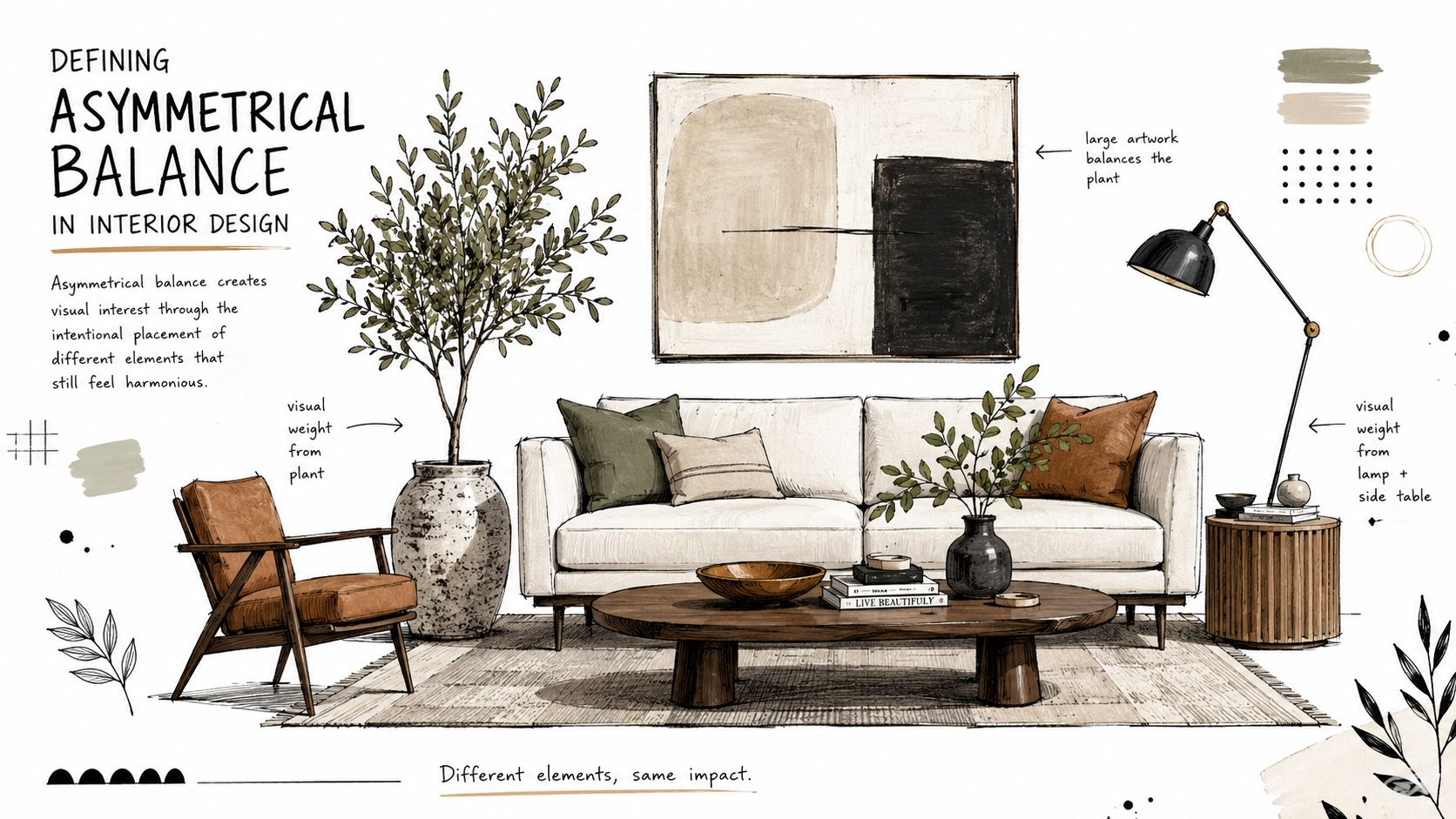
A small apartment living room with one long wall, a corner window, and not much floor space can feel awkward fast. A matching furniture set often makes that kind of room feel boxed in, while a more uneven arrangement can help it breathe. Asymmetrical balance is the method of arranging different pieces so their combined visual weight feels steady, even when they are not identical.
The simple rule behind the look
A room does not need matching items on both sides to feel settled. A sofa can be balanced by a floor lamp, a tall plant, a side table, or a grouped set of decor that carries similar visual weight without taking up the same amount of physical space. The eye responds to the full arrangement, so the goal is steadiness, not duplication.
That is why designers often rely on a few practical moves, including contrasting furniture sizes, varying heights, and odd-number groupings such as 3, 5, or 7 objects Castlery's asymmetrical balance guide. These choices help a room feel intentional without turning it into a mirror image. In a narrow rental living room, for example, a single armchair on one side of a sofa can be balanced by a lamp, a stack of books, and a plant on the other side, so the room feels finished without needing another bulky seat.
Asymmetrical balance also fits into 20th-century design thinking, especially the Bauhaus movement launched in Germany in 1919 Castlery's asymmetrical balance guide. That background matters because it shows the idea is not just a styling trick for modern photos. It comes from a longer tradition of arranging rooms so they work with real life.
What makes it different from symmetry
Symmetry gives the eye a clear mirror line. Asymmetry gives the eye a conversation between different objects. One approach often feels more formal, while the other feels looser and easier to adapt to lived-in rooms.
The useful shortcut is to think in terms of visual mass, not matching sets. If one side of a room feels bold, tall, or crowded, the other side needs something that feels equally present, even if it is smaller, lower, or made up of several pieces. A pair of small objects can sometimes balance one larger item better than a single medium object because the grouped pieces add up visually.
The room is balanced when your eye can move through it without getting stuck on one oversized shape or one empty corner.
Visual Weight Factors at a Glance
| Factor | Adds Visual Weight | Reduces Visual Weight |
|---|---|---|
| Size | Large furniture, oversized art | Small accents, slim profiles |
| Height | Tall lamps, bookcases, vertical decor | Low tables, short objects |
| Color | Dark, bold, saturated tones | Pale, muted, light tones |
| Texture | Dense, layered, highly detailed surfaces | Smooth, simple, open surfaces |
| Placement | Off-center, clustered, visually dominant positions | Isolated, airy, spaced-out placement |
A table like this helps when a room feels off but you cannot explain why. The fix is rarely adding more decor. It is usually smarter placement, lighter repetition, or a better mix of tall and low pieces, especially in tight rooms where every object has to earn its place.
Historical Roots of Asymmetrical Balance
A room with mismatched chairs, an off-center lamp, or a wall that refuses to line up can feel awkward at first. Asymmetrical balance grew out of the need to make those situations feel intentional. It developed through modern design thinking in the 20th century, then became more useful as homes shifted toward open-plan living. Once a single room had to serve as seating area, passageway, and gathering space, perfectly matched furniture sets started to work against daily life.
From formal rooms to flexible homes
Traditional layouts often depended on strict alignment. A sofa faced a pair of chairs, lamps matched, and décor mirrored itself across a central axis. That approach works when the architecture is formal and the room is generous. It becomes harder when a home has to support movement, family routines, and mixed-use zones, especially in smaller rooms where every piece has to pull its weight.
Modern interiors responded by favoring visual equilibrium without mirror-image layouts. The room still needed to feel settled, but it no longer had to look repetitive. That shift made asymmetry more than a style choice. It became a practical answer to how people use their homes, especially when the budget leaves little room for buying perfectly matched sets.
The same logic still shows up in current guidance, including mixing patterns with balance. Designers often begin with a focal point, such as a fireplace, large artwork, or window, then counterweight it with another element of similar visual mass, like a bookshelf, lamp, or grouped décor. In a tight entryway, that might mean a tall mirror on one side and a small bench with wall hooks on the other. In a narrow living room, it can mean balancing a sofa with a plant, floor lamp, or a cluster of framed art. The method turns an abstract idea into a room plan that fits real homes.
Why that history still matters
The historical part is practical, not academic. It explains why asymmetry adapts so well to living rooms, dining rooms, and entryways. Those are the rooms where circulation matters, where architecture is not always centered, and where hard matching can make the layout feel forced.
It also explains why stylists keep using the same core method across homes and markets, off-center placement, mixed heights, and a limited palette. The method has lasted because it solves real spatial problems. A renter can use it with movable pieces and layered décor. A homeowner can use it to soften awkward corners, offset a fireplace, or make a long wall feel more deliberate. For a room that needs to feel calmer and more reflective, the spiritual interior design guide pairs well with asymmetry because both approaches pay attention to how a room feels, not just how it fills out.
Visual Weight Principles That Create Harmony
A room can be asymmetrical and still feel calm if the heavier objects are doing their job. That job is simple, hold attention without overwhelming the rest of the space. The design challenge is learning which pieces read as heavy and which ones can subtly support them.
The four controls that matter most
The easiest way to think about visual weight is to treat it like a set of dials. Size, color, texture, and placement all change how much attention a piece pulls. A large dark cabinet usually feels heavier than a small pale stool. A tall plant often feels heavier than a low bowl because it occupies more of the room's vertical field.
Dark, tall, bulky, or clustered objects generally carry more weight than pale, low, or isolated objects Povison's asymmetrical balance guide. That means a large sofa or art piece can be offset by a floor lamp, a plant, or grouped decor on the other side YouTube visual-weight explanation. The room doesn't need matching items, it needs comparable presence.
How to use the rule without overthinking it
Start with the biggest thing in the room, then ask what it's asking for. A sofa may need a tall lamp to the other side. A blank wall may need a shelf or grouped artwork. A dark TV wall may need lighter pieces nearby so the whole wall doesn't sink visually.
Here are a few practical pairings that work well in ordinary homes:
- A bulky sofa can be balanced by a slender floor lamp and a tall plant.
- A tall bookcase can be offset by low seating and a wide rug.
- A dark media unit can be lightened by wall art and open space on one side.
- A clustered decor group can be balanced by a single larger object across the room.
Asymmetrical balance becomes easier when the room has repeated cues. A little repetition in wood tone, finish, or fabric keeps the space from feeling random. That's also where mixed surfaces and pattern choices matter, which connects naturally to Miller Waldrop's mix-and-match balance guide.
Useful shorthand: If one object is heavy in size, make the counterweight heavy in height, texture, or grouping.
The biggest mistake is trying to make every side “equal” in the same way. Equal doesn't mean identical. It means the room feels steady when the eye moves from one side to the other.
Applying Asymmetrical Balance Room by Room
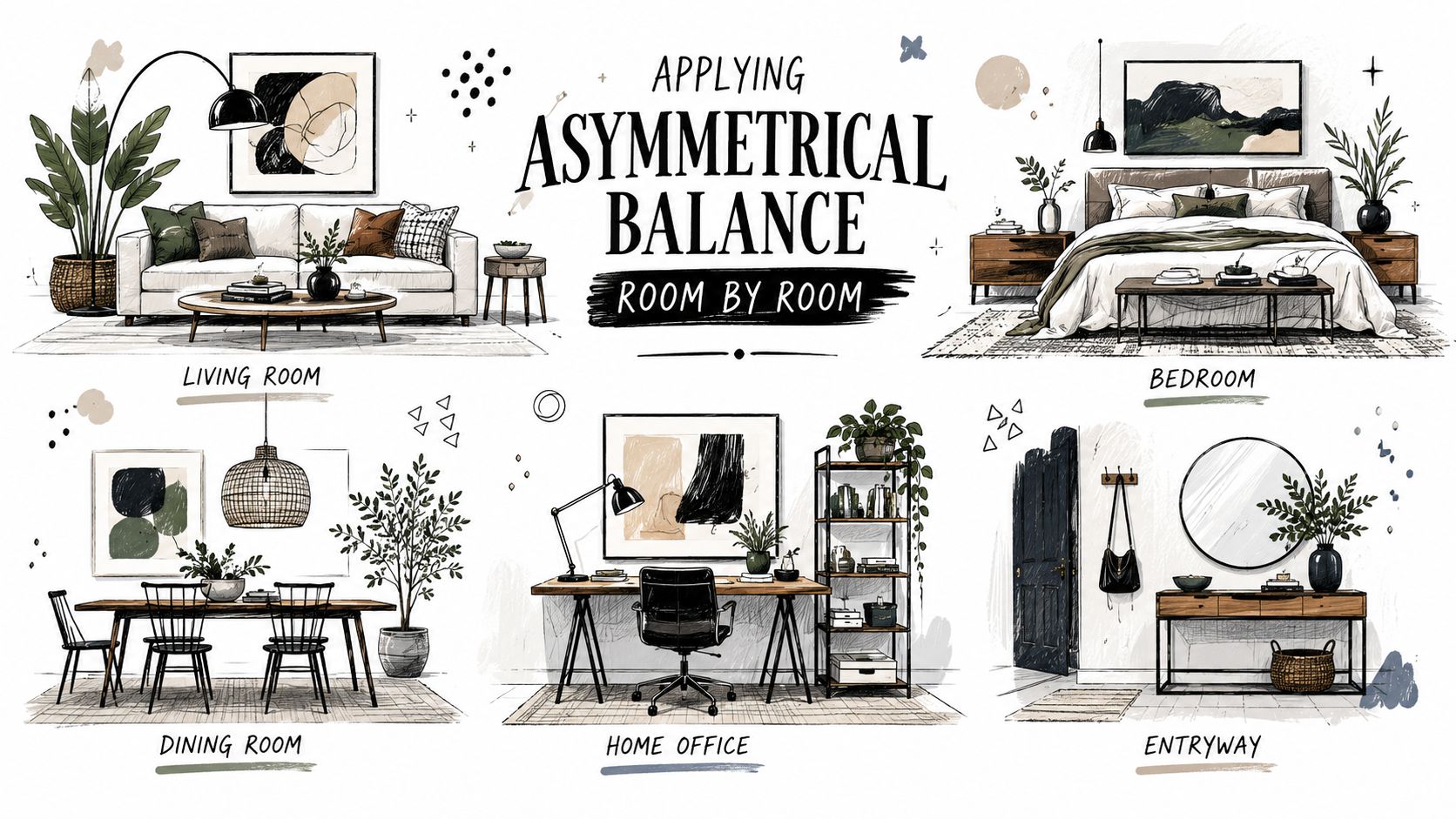
Small rooms and awkward layouts benefit from asymmetry because they rarely leave enough space for perfect pairing. Start with circulation, then place visual weight where it does the most work. That keeps the room easy to move through while still giving it a clear sense of order.
A useful way to judge each room is to ask what the room needs to feel steady. Sometimes that answer is height, sometimes it is a lighter opposite side, and sometimes it is more open floor space. The goal is not to fill every gap, it is to make the room feel deliberate from the entrance onward.
Living rooms need one anchor and one release point
A living room usually begins with a clear anchor, such as a sofa, fireplace, or TV wall. The opposite side should answer that anchor without copying it. A sectional, for example, can be balanced by a tall plant, a floor lamp, and a single accent chair rather than another large seat.
In a small living room, one side can stay lighter on purpose. Open space near a walkway often helps more than another side table. Off-center art works well too, because it directs the eye without taking up floor area, much like a well-placed pause in a conversation keeps the whole room from feeling crowded.
For rooms that already feel visually busy, combine a heavier piece with a quieter cluster. A dark sofa may need a brighter wall, a slender lamp, or a rug that visually stretches the floor. If the sofa sits against one wall, a single chair or plant on the other side can be enough to keep the composition from tipping.
Bedrooms work best with quiet imbalance
Bedrooms usually feel calmer when they avoid full mirror-image formality. The bed can stay centered while the objects around it shift slightly, especially if one side needs a better path to the closet or door. Different nightstands can still feel balanced if their lamps, books, or artwork carry similar visual mass.
A bench at the foot of the bed can also help, especially in narrow rooms where a bulky dresser would block circulation. The room stays organized, but it does not feel boxed in.
Rental bedrooms often need this kind of flexibility. If you cannot change built-ins or move outlets, use bedding, lamps, and wall art to shift the visual weight instead of forcing a furniture set to match perfectly. A soft throw on one side and a taller lamp on the other can do the work of a much more expensive redesign.
Entryways and awkward corners need usefulness first
Entryways often create asymmetry naturally, because there is usually a door swing, a narrow wall, or a corner that will not accept a full furniture set. A console on one side can be balanced by a mirror, a basket, or a vertical lamp. If the wall is short, use a grouped arrangement instead of forcing a large single item into the space.
Corner-heavy layouts benefit from restraint. The aim is to make the space feel intentional, not stuffed. That matters in rentals, where wall placement and walk paths are often fixed, and it matters in older homes too, where odd angles can make a room feel more cramped than it really is.
A small entry can still feel finished with simple pieces that carry different jobs. A slim table gives you a landing spot, a mirror bounces light, and a bowl or basket keeps the surface from looking abandoned. That mix behaves like a conversation between pieces, each one doing a different task without competing for attention.
For readers building a calmer entry or mediation-friendly room, the spiritual interior design guide offers a thoughtful perspective on atmosphere and visual ease.
A room-by-room habit that helps
Before adding anything, check whether the room still has clear movement, open sightlines, and one dominant focal point. If those three things are intact, asymmetry usually feels natural. If one is missing, the room starts to feel crowded instead of balanced.
Common Asymmetrical Balance Mistakes to Avoid
The biggest mistake is assuming asymmetry means “different on both sides.” That's not balance, that's randomness. A room only feels successful when the differences still follow one clear logic, such as repeating a finish, matching visual mass, or protecting open space.
The errors that make rooms feel messy
One common problem is overfilling both sides of the room. People try to make each side equally interesting, and the result is a space that feels busy everywhere. Another mistake is ignoring negative space, which is the breathing room that lets the larger pieces register.
A third issue is accidental symmetry. That happens when two objects aren't identical, but they're so similar in height, tone, and weight that they cancel out the asymmetrical effect. The room then feels neither balanced nor expressive, just indecisive.
Stand at the entrance, squint until details blur, and watch where your eye stops first.
That simple test helps reveal whether one side is too heavy. It's also where the photo check becomes useful. A photo taken from the entrance flattens the room into masses and gaps, so it becomes easier to spot a dark cluster, a tall corner, or a blank area that's doing too little Paint It AI's asymmetry diagnostic. If one side feels visually heavier, the opposite side needs counterweight. If the room feels busy everywhere, something should be removed before anything else gets added Paint It AI's asymmetry diagnostic.
What to fix before buying more decor
A room often improves faster by subtraction than by addition. Pull one item, step back, and look again. If the layout suddenly breathes, the room didn't need another purchase. It needed less crowding.
A few quick adjustments usually help more than a complete reset:
- Reduce competing objects: Remove one piece if several small items are fighting for attention.
- Break up matching pairs: Shift one lamp, chair, or tabletop object off center.
- Protect open space: Keep at least one clear path or visual lane uninterrupted.
- Repeat one anchor detail: Reuse a wood tone, color, or finish so the room still feels connected.
Asymmetry works best when the eye can rest somewhere. If everything is trying to be the focal point, nothing feels balanced.
Styling Tips and Design Services to Get Started
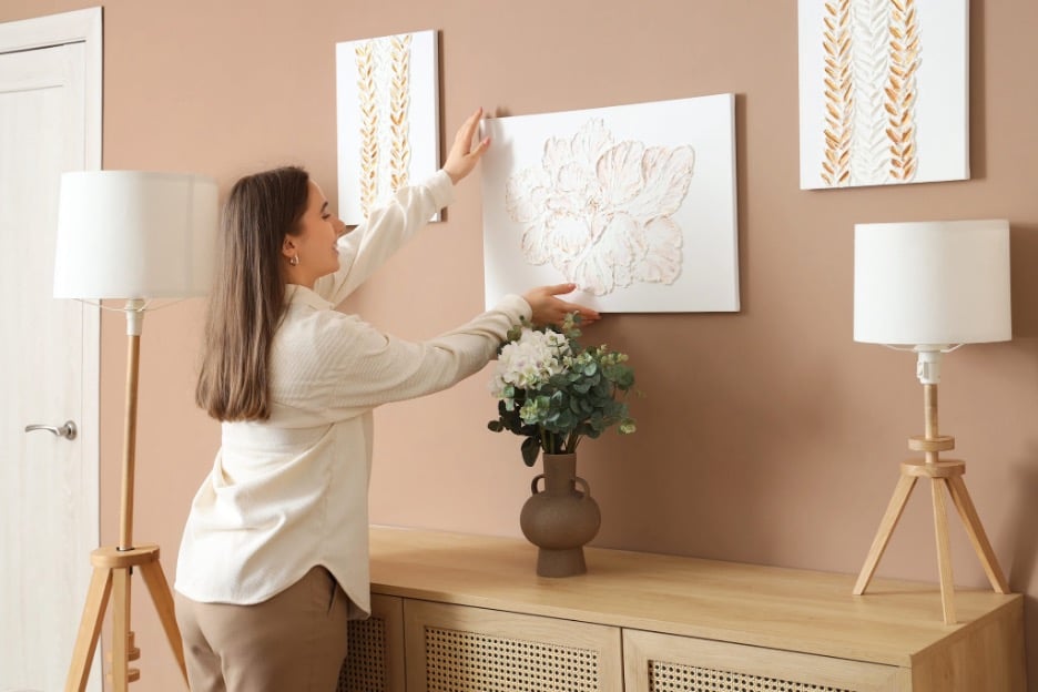
Good asymmetry usually starts with one strong piece, then a few smaller choices that support it. A statement sofa can anchor a living room, and a slender floor lamp can pull weight on the opposite side without eating up floor space. Wall decor can do a lot too, especially when it varies in height and doesn't line up too neatly.
Make one piece do the heavy lifting
Choose furniture that solves more than one problem. A sofa should fit the room's scale, support the flow of traffic, and carry enough visual presence to ground the space. A console, sideboard, or cabinet can do the same by adding storage and balance at once.
Window treatments matter as well, especially in rooms with off-center openings or uneven wall breaks. The right drapery can make an architectural feature feel deliberate, which is why the staging perspective in The Drapery Company's window treatment guide fits so naturally with asymmetrical planning.
When a room is hard to read, a fresh set of eyes helps. That's where design services become valuable, because layout support can save time, reduce guesswork, and keep the room from drifting into clutter.
A practical shopping mindset
Instead of asking which piece is prettiest, ask which piece solves the room's imbalance. That's a much better filter. A family room may need a sectional that leaves room for a lamp and an accent chair. A bedroom may need a nightstand with more visual presence than the other side, even if the pair doesn't match exactly.
Miller Waldrop Furniture & Decor carries curated living room options from brands like Flexsteel and La-Z-Boy, which makes it easier to find pieces that can support a balanced layout without starting from scratch. For shoppers who want help making those decisions, the store's long-standing service model is built around guidance, selection, and a smoother decorating process.
If the room feels close but not quite right, the next move is simple. Visit the showroom, compare scale and finish in person, and build a room plan around the furniture your space can support.
Miller Waldrop Furniture & Decor helps homeowners and renters find the right pieces for rooms that need balance, function, and a better sense of flow. Explore Miller Waldrop Furniture & Decor to see living room, bedroom, and dining options, then use expert design support to turn an uneven layout into a room that feels finished and easy to live with.