

How to Design Living Room Layout: Expert Tips for 2026

You're standing in a living room that looks right on paper and wrong in real life. The sofa feels too big, the TV can't go anywhere sensible, and every doorway seems to interrupt the one wall you wanted to use. That's the moment to stop decorating and start designing.
A solid living room layout starts with how the room works every day, not with a pretty chair or a trendy rug. In homes across West Texas and New Mexico, the rooms that feel easiest to live in are the ones that respect movement, sightlines, and the actual furniture footprint the space can handle. The average U.S. living room is about 12 by 18 feet, or roughly 216 square feet, and that size is commonly considered comfortable for about 6 to 10 people (ideal living room size guide). That benchmark matters because it tells you what kind of seating, circulation, and anchor pieces the room can realistically carry.
Start With the Room You Live In
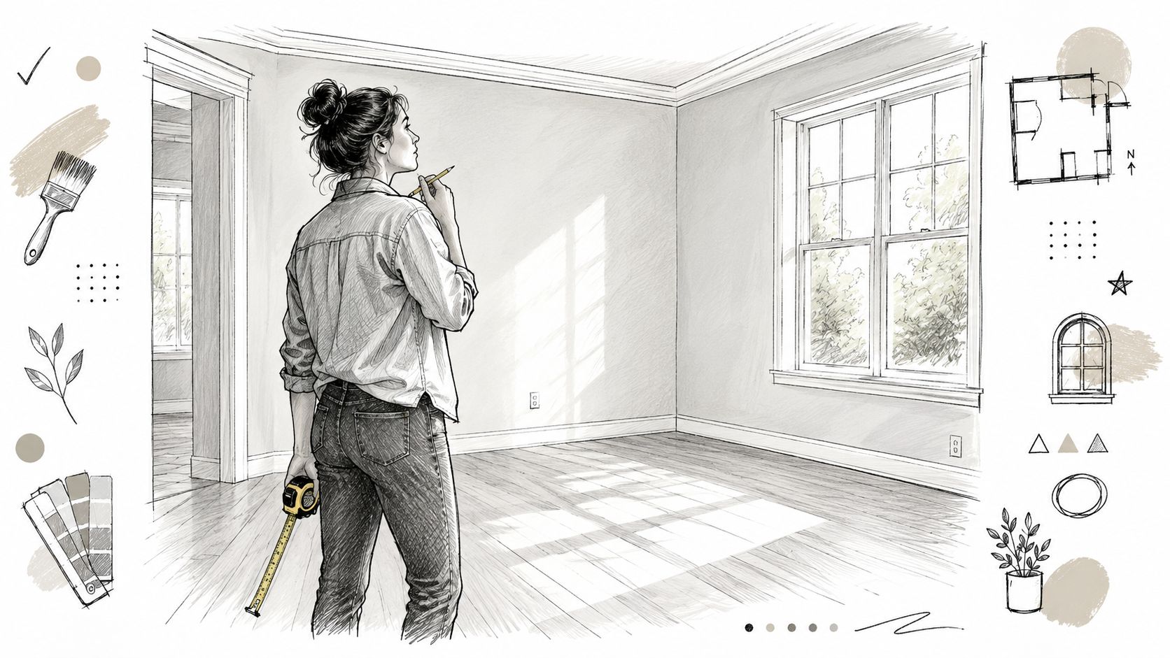
A living room looks generous when it is empty. The minute the boxes come in and the sofa gets pushed where it “fits,” the room tells the truth. Good layout work starts with what the room can handle day after day, the outlet that wants the lamp, the vent that cuts into a console run, the window that sits too low for a tall chair.
Notice the constraints before you buy anything
Every room has fixed points, and they are the first things people should study. Measure the walls, then mark door swings, window widths, built-ins, fireplaces, vents, and switch plates. Those details decide whether a chair sits cleanly in a corner or ends up in the middle of a path used all day.
Practical rule: If the room already has a natural walkway, design around it instead of trying to take it over with furniture.
A rough sketch on paper works fine at this stage, as long as it is to scale. The point is not pretty drafting, it is honest sizing. A room near the common 216 square feet benchmark can usually handle a conversation area, but it will not carry oversized seating zones without crowding movement or blocking sightlines (ideal living room size guide).
Reading the room like a map beats decorating from a mood board. A good floor plan guide from Task Masters Inc. helps turn a rough sketch into something useful, especially if floor-plan symbols and wall breaks are new to you. Once you understand the plan, you can place furniture with intention instead of guessing at scale.
The next number to check is furniture size. A living room furniture dimensions guide keeps you from choosing pieces that look fine online and overwhelm the room in person.
Decide what the room is really for
A living room used for family movie nights needs different spacing than one built mainly for conversation, reading, or through-traffic. If the room carries three jobs, write them down before moving a single piece. That list becomes the filter for every later choice.
A layout for a working household has to answer one blunt question, what happens in this room most days? If people pass through it constantly, protect circulation first. If everyone gathers here after dinner, seating capacity and conversation distance matter more than display surfaces. If the room doubles as a quiet retreat, give it calmer edges and fewer interruptions.
Measure, Map, and Define How the Room Works
Build the floor plan before the furniture plan
A living room layout starts with a floor plan, not a shopping list. Measure the room, draw it to scale, mark every fixed element, then place furniture only after the boundaries are clear. That order keeps expensive mistakes off the truck and away from the front door.
Start with wall lengths, then mark the exact position of doors, windows, built-ins, fireplaces, vents, and outlets. If the room has an awkward bump-out or a load-bearing wall that will stay put, fold it into the plan instead of treating it like a problem to hide later. Those fixed elements decide where a sofa can sit without crowding the path and where a chair will feel stranded.
Then map how people move through the room. Hallway to kitchen, entry to seating, one side of the room to the other, those are the routes that matter. If furniture cuts across those lines, the room feels tight even when the pieces themselves are sized well. A clear drawing exposes that before anything gets moved.
Define the room's main job
A living room gets easier to plan once you name what happens there most days. A family that watches sports together needs a different setup than a couple that hosts guests around a fire. A room that doubles as a homework zone needs surfaces and sightlines that a formal sitting room does not.
The planning question is simple, what has to happen here without friction? If the room is a pass-through, keep the central lane open. If it is mostly for hosting, arrange the seating so people face each other cleanly. If it is for unwinding at night, give the room a calm viewing angle and fewer interruptions.
For a reality check on scale, the living room furniture dimensions guidance at Miller Waldrop's sizing resource helps turn room measurements into usable furniture choices before you buy. Keep the earlier size constraints in mind as you do that. They tell you where the room can breathe and where it will start to feel packed.
Write the room's job on paper before writing its check list. The furniture should serve that job, not fight it.
A usable plan ends with two lists, the fixed constraints and the flexible zones. The fixed list includes openings, vents, outlets, and built-ins. The flexible list includes seating, tables, lamps, and storage. Once those are separated on the drawing, the room starts telling the truth.
Anchor the Room With a Focal Point and the Largest Piece
Pick the visual anchor first
A living room needs one place where the eye naturally lands. That anchor may be a fireplace, a TV, a strong window view, or wall art that carries the room. Seat the room toward that point without making the whole space feel rigid.
A fireplace usually calls for a centered arrangement. A TV needs a viewing angle that does not strain necks. A window view can carry the room well, but only if the furniture leaves the light open and does not send the eye into a dead end. If the room has more than one focal point, balance wins. Competition does not.
The furniture should support that anchor, not line up around it like a showroom display. In many homes, that means placing the main seating group so it can face the focal point and still support easy conversation across the room. The room should feel settled, not staged.
Put the largest piece in first
The sofa sets the scale, so place it first. Once the largest piece is in position, the rest of the room becomes easier to read. Standard interior-design spacing guidelines call for 30 to 36 inches between major pieces, with a tighter fallback of about 18 to 24 inches in constrained rooms, because that keeps circulation working and the room from feeling jammed.
The sofa should usually sit 3 to 5 inches off the wall instead of pressed flat against it. A little breathing room makes the layout feel deliberate. The coffee table belongs about 16 to 18 inches from the sofa, close enough to use, far enough to keep knees safe.
The rest of the pieces should build around that anchor. Accent chairs, consoles, and media storage come second, because they need to serve the sofa, not fight it. A coffee table that is about half the length of the sofa often reads in proportion, and a rug should cover enough ground for at least the front legs of the major seating pieces. If you are working with a compact footprint, a sectional for small spaces can give you structure without crowding the room.
A quick tape outline on the floor is worth doing before anyone starts lifting. It shows whether the room can handle the size and whether the walking paths still make sense. If you want a fast way to test several arrangements before you move a single heavy piece, you can also browse free AI interior design tools. That small check catches more bad layouts than expensive furniture returns ever will.
Match Layout Templates to Your Room Size and Shape
Choose the template that fits the footprint
Start with the room you have, not the room you wish you had. A narrow living room needs a different plan than a square one, and a large open room needs more restraint than a compact den. The classic conversation layout works best when the room can hold two or more seats facing one another without forcing people to cut through the middle every time they walk in.
A TV-and-fireplace pairing works when the room has to handle screen time and still keep a warm focal point in view. The seating should support both anchors, and in real homes that usually means flexible pieces instead of a stiff, over-arranged setup. If the room pulls double duty, the layout has to do the same.
Use sectional, two-chair, or symmetrical layouts with discipline
An L-shaped sectional makes sense in open-plan homes when you need to define a seating zone without adding walls. It gives the room structure, but only if traffic can move around it without squeezing past corners. For a smaller room, a compact sectional layout for smaller footprints can give you the right amount of seating without swallowing the floor.
A two-chair setup often beats a sofa in a small room because it keeps the space lighter and leaves more open floor around the center. That matters in homes where the living room also has to feel easy to cross, easy to clean, and easy to use every day. A sofa is not always the smartest first move.
A symmetrical arrangement works in larger, more traditional rooms where the goal is order and visual calm. Matching chairs, paired lamps, and balanced side pieces can settle a formal room without making it feel stiff. Use symmetry where the room can carry it, not where the room is begging for flow.
If the room has to serve as both a hangout and a pass-through, protect the walkway first. That may mean floating furniture, using fewer pieces, or choosing a sectional with a smaller footprint. A layout that blocks the route to the kitchen is not a finished room, it is a layout mistake wearing nice fabric.
For households comparing shapes and scale without guessing, browse free AI interior design tools can help generate rough arrangement ideas before any furniture gets moved. Use those ideas as a working sketch, then judge each one against the room, the traffic pattern, and the seating you need.
Pick the template that makes the room easier to live in. If it makes crossing the room harder, cleaning harder, or daily use less comfortable, it is the wrong template.
Layer in Rugs, Lighting, and Traffic Flow
Make the rug do real work
A rug sets the room's working zone. It tells the eye where the seating area starts and stops, and it keeps the furniture from looking like it is drifting in open space.
Choose a rug that is large enough for at least the front legs of the main seating pieces to sit on it. In rooms with more breathing room, a border of about 12 to 24 inches from the wall keeps the rug looking intentional instead of squeezed in. If you need help getting the size right, use our rug-sizing guide. In tight rooms with sharp corners or tricky paths, a round or oval rug softens the layout and makes movement easier.
Shape matters more than people admit. A square rug can box in a narrow room. A round rug can calm an awkward corner and break up the hard stop-start feeling that too many right angles create.
Treat lighting as part of layout
Lighting shapes how the room works after dark. A room with only overhead light usually feels flat, while layered light makes the seating area easier to use and clearer to read.
Use ambient light, task light, and accent light together. A floor lamp beside a chair makes reading possible, and a pair of sconces flanking a sofa can define the seating zone without adding visual clutter. Good lighting also helps a room that serves more than one purpose feel organized instead of scattered.
Keep the walk clear
Traffic flow should stay open enough that people can cross the room without sidestepping furniture. Main walkways should stay at least 36 inches wide. That keeps daily movement easy and cuts down on collisions, especially in rooms that connect to the kitchen, hallway, or entry.
After the furniture is placed, check doors, drawers, and remote-control reach. A room can look finished and still fail if someone has to stand up to open a cabinet or reach around a table for the remote. Good layout protects those ordinary movements, because those are the ones that happen every day.
Troubleshoot the Layout Mistakes That Ruin Good Rooms
Fix the problems that make a room feel off
The most common mistake is the wall-hugging sofa. It looks safe, but it usually makes the room feel like a waiting area. Pulling the sofa slightly off the wall gives the room depth and makes the seating feel chosen instead of dumped.
A too-small rug is another easy miss. It shrinks the seating area and leaves the room visually scattered. The fix is simple, the rug needs to connect the major pieces, not sit under one small corner of the arrangement.
Watch the doorway, the TV height, and the hidden obstruction
A chair that blocks the doorway doesn't just look awkward, it changes how the room is used. Move it until the entry feels natural, then let the rest of the arrangement adapt around that clear path. A TV mounted too high creates neck strain and makes even a good seating plan feel wrong, so the viewing angle has to be checked before the arrangement gets locked in.
Harder rooms need smarter pieces. Swivel chairs help when the room has multiple focal points. Round coffee tables reduce corner conflicts. Modular sectionals can solve odd angles and tight turning paths without making the room feel overfilled.
Problem to solve: If the layout only works when nobody moves, it isn't a living room layout. It's a still life.
Handle awkward rooms without forcing symmetry
Multiple focal points are common now, especially where a fireplace and TV both matter. The answer isn't to pretend one doesn't exist, it's to give each one a role. A room can support both as long as the seating doesn't freeze the flow or split the room into competing camps.
Built-ins and narrow doorways also deserve respect, not resistance. Furniture should fit the path available, not the fantasy path someone hoped for in a catalog. In a tricky footprint, the best move is often fewer, smarter pieces instead of more coordinating ones.
For households that want to test real pieces against a real room, Miller Waldrop Furniture & Decor offers in-home design services that include measuring furniture to help confirm fit before purchase. That kind of check matters most in rooms where one bad scale choice throws off the whole plan.
Your Layout Checklist and the Next Step Toward a Real Sofa
A good final check is short and practical. The room measurements are confirmed, the focal point is chosen, the largest piece is placed, the secondary seating supports the anchor, the rug connects the zone, the lighting layers are in place, and the main walkways stay clear. If one of those items is missing, the room isn't finished yet.
The next move is not guesswork, it's testing. Bring the measurements, the rough sketch, and the questions into a showroom where scale, comfort, and fabric can be judged in person. A hands-on conversation with a design team can turn a decent floor plan into a purchase that works well at home.
For local shoppers in West Texas and Southeastern New Mexico, Miller Waldrop Furniture & Decor is a practical place to compare living room collections and get help matching pieces to the room's real dimensions.
A CTA for Miller Waldrop Furniture & Decor.